SARIMAX, Prophet, XGBoost, LSTM, and N-BEATS broken down without any pretentious math. Pick the right model in under five minutes today.
The 9 billion dollar lesson.
In November 2021, Zillow walked into a conference room and admitted that their AI had set 7,000 houses on fire. Not literally. Financially. They’d built an algorithm to buy and flip homes, and the algorithm spent two years quietly overpaying for everything in Phoenix, Atlanta, and a dozen other markets. By the time they noticed, the company had to take a 304 million dollar write-down, lay off a quarter of the entire staff, and shut down the iBuying business completely. The market cap dropped about 7.8 billion dollars in days.
The CEO blamed unpredictability. The data scientists got the side eye on Twitter. The post-mortems all said the same thing in different words. The forecasting model worked great until the world changed and nobody noticed.
This is a time series problem. A famously expensive one. And after you finish this article, you’ll understand exactly why it went wrong, exactly how a more careful forecaster would have caught it, and exactly which tests would have screamed before any houses got bought.

You already forecast. You just don’t call it that.
Take a moment. Right now. Glance out the window and guess if it’ll rain in two hours. You’ve got an answer. Maybe a confidence level too. Congratulations, you just ran a forecasting model in your head.
Your phone does it for you a hundred times a day. Maps predicts traffic. Spotify predicts the next track. Your weather app predicts the rest of the week. Even your body forecasts. It knows when you’ll feel hungry by 7 PM because you usually feel hungry by 7 PM.
The technical name for this is time series forecasting, and the math is older than your grandparents. The first serious model came from the 1920s. The Yule autoregressive equations. We’ve been refining this for a century. We’re not exactly working with new tools.

What makes time series different from ordinary data? Memory. Today depends on yesterday, and yesterday depends on the day before, all the way back to whenever the data started. You can shuffle a list of customer ages and lose nothing useful. Shuffle a stock price history and you’ve reduced it to nonsense. Order is sacred. Time isn’t a label, it’s the spine.
The three ingredients in every messy series
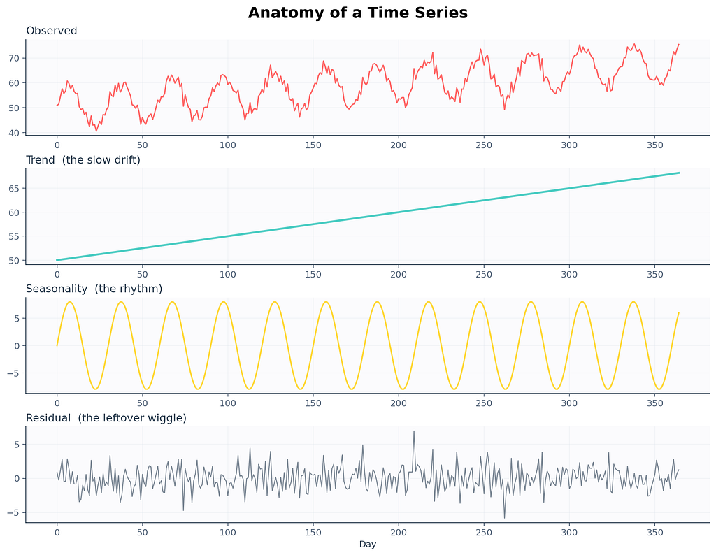
Pretty much every time series you’ll ever meet is three things layered on top of each other. Once you can name the three layers, you’ve already passed the first interview question. There’s a leaf blower screeching somewhere on my street that’s making this paragraph harder to write, but the metaphor still holds. Every series is a noisy stack.
Trend. The slow drift. Are the numbers generally rising over months? Falling? Flat? Trend is the long story. Earth’s average temperature. Your kid’s height. The number of people who still own a fax machine.
Seasonality. The repeating heartbeat. Pumpkin spice sales spike every October. Gym memberships peak the first week of January and die by February 15. Electricity demand in Stockholm crashes every July when everyone leaves for the archipelago.
Residual. The leftover wiggle. Whatever’s left after you account for the trend and the season. A surprise rainstorm. A celebrity tweet. A holiday Monday that fell on the wrong week. The fuzz.
Here’s a real one to make this concrete. A 2017 paper from the M-competitions analyzed call centers and found something strange. Banking call centers have 169 seasonal cycles per day. That’s not a typo. They aggregate calls every 5 minutes, and each 5 minute slot has its own pattern. Mondays at 10:13 AM look completely different from Mondays at 10:18 AM, and both look different from Tuesdays at the same minute. Reality is gloriously weird.
Why this matters for you. Decomposition is the very first thing pros do when they meet new data. You can’t pick a model if you don’t know what’s in your data. Strong yearly cycle. SARIMA. Mostly random. Try the simplest baseline. Naming the parts changes the model.
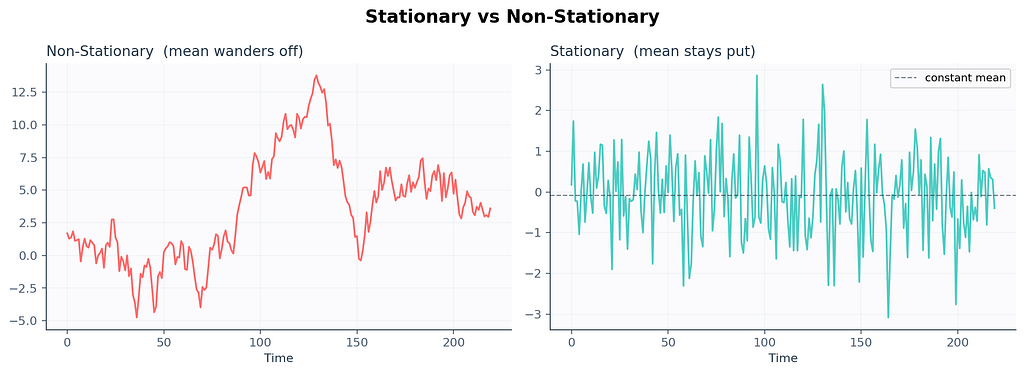
Stationarity. The most boring superpower in the universe.
A series is stationary when its statistical properties stop drifting over time. The mean stays put. The variance doesn’t bloat. The way today correlates with yesterday isn’t shape-shifting. The flickering streetlight outside my apartment? Stationary. The price of houses in my neighborhood since 2019? Definitely not.


Why does anyone care? Because most classical models, especially the ARIMA family, assume your data is stationary before they touch it. Feed them a wandering series and they’ll learn nonsense. Then they’ll forecast nonsense back at you, with a confidence interval that looks suspiciously confident. This is roughly what happened to Zillow in slow motion. Their model was trained on housing markets that were fundamentally non-stationary, and it kept extrapolating an upward trend that the world stopped agreeing with.
How do you check stationarity in code? Use the Augmented Dickey Fuller test (ADF). The null hypothesis is that the series is non-stationary. If the p-value comes back below 0.05, you can reject the null and call your series stationary enough for ARIMA-style models.
# I am about to ask whether this series sits still long enough to model
from statsmodels.tsa.stattools import adfuller
#
result = adfuller(series.dropna())
print(f"ADF statistic : {result[0]:.4f}")
print(f"p-value       : {result[1]:.4f}")
print(f"used lags     : {result[2]}")
print(f"observations  : {result[3]}")
print("critical values:")
for k, v in result[4].items():
    print(f"   {k}: {v:.4f}")
# below 0.05 means probably stationary
# more negative ADF statistic means more confident
If the p-value comes back at 0.42, your series is wandering. The fix is the next section. It’s almost embarrassingly easy.
Differencing. The duct tape that just works.
Take today’s value. Subtract yesterday’s value. You just differenced a series.
That’s it. That’s the whole technique. Real ARIMA papers will lecture you about backshift operators and Wold decomposition theorems, but at the end of the day, somebody is doing y_t minus y_t-1 in a for-loop and pretending it's profound.
# turning a wandering series into a well behaved one in one line
diffed = series.diff().dropna()
# subtract the previous value, drop the NaN at the very start
# we drop NaN because the first row has nothing to subtract from

Sometimes one round isn’t enough. The series is still drifting, because the rate of change itself is going up. In that case you difference again. Twice. We call this the order of integration, and it’s the d in ARIMA(p, d, q). Most real series need d equal to 0, 1, or 2. If you’re tempted to set d to 5, the data isn’t the problem. You are.
There’s also seasonal differencing. Instead of subtracting yesterday, you subtract the same day last year, or last week, or last hour-of-the-day. This kills seasonal patterns the same way regular differencing kills trends. We’ll see this again in SARIMA.
Why this matters for you: Differencing is the stationarity hammer. Knowing how many times to swing it is the difference between a forecast that holds up in production and one that explodes three weeks after deploy.
Autocorrelation. The ghost of yesterday haunting today.
A time series is not a bag of independent samples. Today is haunted by yesterday. Sometimes by last week. Sometimes by the same day last year. Autocorrelation is just a fancy word for measuring how much.
Two tools you’ll see everywhere. ACF and PACF. They look similar. They’re not.
ACF (autocorrelation function). For each lag k, how correlated is today with the value k steps ago? If today is correlated with yesterday, and yesterday with the day before, ACF will show a slow decay because the dependency leaks through the chain.
PACF (partial autocorrelation function). Same idea, but at each lag k, it strips out the influence of all the lags between today and k steps ago. PACF tells you whether yesterday-of-yesterday-of-yesterday directly influences today, ignoring the middlemen.
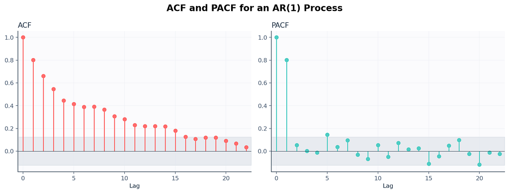

There’s a quick rule of thumb that survives every textbook revision.
A spike at lag p in PACF that drops to zero afterwards usually means an AR(p) process. Slow ACF decay with sharp PACF cutoff. Same idea on the other side. Sharp ACF cutoff at lag q with slow PACF decay usually means an MA(q) process. Both at once, mixed cutoffs, you’re probably looking at ARMA. The two plots together are basically a stethoscope for time series.
I had a sticky note above my monitor for three years that just said if PACF cuts at 1, try AR(1) first. That sticky note saved me hours.
Decomposition. Picking apart the casserole.
Two ways to decompose a series. The choice depends on a single question. Does the seasonal swing get bigger as the trend grows?
Additive. y_t equals trend plus season plus residual. Use this when seasonal swings stay roughly the same size regardless of where the trend is. Hospital admissions tend to be additive. December still gets more flu than July. The gap is fairly constant year to year.
Multiplicative. y_t equals trend times season times residual. Use this when seasonal swings grow with the trend. Retail sales are usually multiplicative. December peaks get taller every year because the baseline gets bigger. Christmas at a tiny startup looks small. Christmas at Amazon looks like a tsunami. Same shape, different amplitude.
# decomposition is the first plot I always make. always.
from statsmodels.tsa.seasonal import seasonal_decompose
#
# additive when seasonal amplitude stays constant
# multiplicative when it scales with trend
decomposition = seasonal_decompose(series, model='additive', period=12)
# the period argument is the season length
# weekly data uses 7. hourly might use 24. monthly 12.
#
decomposition.plot()
plt.show()
# without plt.show() nothing renders
There’s also STL decomposition, which is more flexible than the classical method. It handles changing seasonality, outliers, and missing data better. In modern code, prefer STL.
Why this matters: I once told a retail client their December would be 10 percent bigger than November because the additive model said so. December turned out to be 60 percent bigger. The boss was not amused. The model was multiplicative. The lesson cost us a contract renewal.
The naive forecasts that quietly humiliate everyone
Time for the most embarrassing fact in the field. In the M5 competition, with 100 million data points and 5,000 teams, about 92.5 percent of submissions failed to beat a simple exponential smoothing baseline. That’s after months of work. After GPU bills. After deep learning architectures with names that sound like cryptocurrencies.
Your first forecast should always, always, always be as dumb as possible. Sometimes the dumb forecast wins, and you save yourself two weeks of wasted training runs.
Naive. Predict next value equals last value. y_hat_t plus 1 equals y_t. That's the model. There's nothing else.
Seasonal naive. Predict next value equals the value from one full season ago. Weekly data, predict next Tuesday equals last Tuesday. Crushes most beginner ARIMA submissions.
Average. Predict next value equals the historical mean. Mostly silly. Useful sanity check.
Drift method. Like naive but adds the average historical slope. y_hat_t plus h equals y_t plus h times (y_t minus y_1) divided by (t minus 1). Slightly less silly.
# the simplest possible benchmark you should compare every fancy model against
def naive_forecast(history, h):
    # predict h steps into the future as a flat line at the last observed value
    return [history[-1]] * h
#
def seasonal_naive(history, h, season_length):
    # repeat the last observed season as the forecast for h steps ahead
    forecasts = []
    for i in range(h):
        # for each future step, grab the value one season ago in the cycle
        forecasts.append(history[-season_length + (i % season_length)])
    return forecasts

If your million parameter neural net cannot beat seasonal naive on your data, your data is too small, your features are wrong, your model is overfitting, or all three at once. Always benchmark first. Always.
Exponential smoothing. The silver-haired assassin.
Every couple years, somebody runs a benchmark on real business data and the same boring method wins. Exponential smoothing. Invented in 1957 by Robert Brown for the U.S. Navy. Still beats most things. Microwave clock in my kitchen is blinking 12 zero zero from a power outage two days ago, and exponential smoothing has been working reliably since color television was new.
The intuition. A weighted average of the past, where weights decay exponentially. Recent values matter more. Distant values matter less. The decay rate is one knob you tune called alpha.
l_t equals alpha times y_t plus (1 minus alpha) times l_t-1
If alpha is 0.9, you basically trust today and shrug at the past. If alpha is 0.1, you trust the past and barely react to today. Alpha lives between 0 and 1 and the model finds the best one for you.
The family has three popular members.
SES (Simple Exponential Smoothing). No trend, no seasonality. Forecast is a flat line at the smoothed level. Good for stationary series.
Holt’s linear method. Adds a trend term. Good for series with a steady drift but no seasonality. Used heavily in finance for projecting things like total accounts outstanding.
Holt Winters. Adds seasonality on top. Three smoothing equations now. One for level, one for trend, one for seasonal effect. This is what you reach for when you have a clear yearly or weekly cycle and want a model that’s interpretable, fast, and doesn’t need a graphics card.
# Holt Winters in three lines. yes, three lines. fight me about it.
from statsmodels.tsa.holtwinters import ExponentialSmoothing
#
model = ExponentialSmoothing(
    series,
    trend='add',
    seasonal='add',
    seasonal_periods=12,
)
# trend 'add' for additive, 'mul' for multiplicative, None for no trend
# seasonal 'add' if seasonal swings stay constant, 'mul' if they grow
# seasonal_periods is one full season. monthly data uses 12.
#
fitted = model.fit()
# fits alpha, beta, gamma all at once via maximum likelihood
forecast = fitted.forecast(steps=24)
# steps is how far you want to look. far futures get fuzzier.
In 2026, if you want a faster modern version, use Nixtla’s StatsForecast library. It runs the same equations in compiled code and handles thousands of series at once. The API is almost identical to scikit-learn. Most teams I know have switched.

ARIMA. The household name that scares everyone unnecessarily.
ARIMA stands for AutoRegressive Integrated Moving Average. Three letters. Three knobs. One family of models that has trained more confused students than any other thing in the field.
Let me untangle each piece.
AR(p), the autoregressive part. Today is a function of the previous p values plus some noise. y_t equals phi_1 y_t-1 plus phi_2 y_t-2 plus ... plus phi_p y_t-p plus error. Translation. Today depends on yesterday, the day before, and so on, weighted by some coefficients the model learns.
I(d), the integrated part. This is the differencing we already covered. d is how many times you difference the series to make it stationary.
MA(q), the moving average part. Today is a function of the previous q forecast errors. y_t equals theta_1 e_t-1 plus theta_2 e_t-2 plus ... plus theta_q e_t-q plus error. Translation. Today depends on the model's recent mistakes, weighted by some coefficients. This is the part that confuses everyone. The MA in ARIMA isn't a moving average like a smoothed line. It's a memory of past errors. If your forecast was too low yesterday by 3 units, MA(1) will adjust today's prediction upward by some fraction of that 3.
Stack them together. ARIMA(p, d, q) means difference d times to make the series stationary, then model what's left as AR(p) plus MA(q). That's the whole architecture.
# the canonical ARIMA call. you will type this hundreds of times in your career.
from statsmodels.tsa.arima.model import ARIMA
#
# (p, d, q) chosen via ACF and PACF inspection or auto_arima
model = ARIMA(series, order=(2, 1, 2))
# 2 means use last two AR lags
# 1 means difference once
# 2 means use last two MA lags
#
fitted = model.fit()
# fits everything via maximum likelihood under the hood
print(fitted.summary())
# gives you coefficients, p-values, AIC, BIC. read this. always read this.
forecast = fitted.forecast(steps=12)
# forecast next 12 periods. simple as that.

How do you pick p, d, q without losing a Saturday? Here’s the workflow.
- Plot the series. Eyeball the trend.
- Use ADF to test stationarity. Increase d until the test passes.
- Plot ACF and PACF on the differenced series.
- Sharp PACF cutoff at lag p, slow ACF decay. AR(p) is your first guess.
- Sharp ACF cutoff at lag q, slow PACF decay. MA(q) is your first guess.
- Try a couple combinations. Compare via AIC. Lower AIC wins.
- If you can’t be bothered, use pmdarima.auto_arima or Nixtla's StatsForecast. They'll grid search for you.
# the lazy person's friend. tries combinations, picks one with lowest AIC
from pmdarima import auto_arima
#
auto_model = auto_arima(
    series,
    seasonal=False,
    stepwise=True,
    suppress_warnings=True,
    trace=True,
)
# seasonal True if you have seasonality
# stepwise smart search instead of brute force
# suppress_warnings because warnings are emotional damage
# trace prints what it tried, useful when debugging
print(auto_model.summary())
Why this matters: ARIMA is the lingua franca of forecasting. Every textbook in the last 50 years assumes you can read it. Every interviewer will ask about it. And on a stunning number of real datasets, a careful ARIMA still beats a sloppy LSTM.
SARIMA. ARIMA on its yearly meds.
SARIMA equals ARIMA plus seasonal terms. The full notation is SARIMA(p, d, q)(P, D, Q, s) where lowercase letters are the regular ARIMA orders and uppercase letters mirror them at the seasonal lag, with s being the season length.
Daily series with yearly cycle. s equals 365. Monthly with yearly. s equals 12. Hourly with daily. s equals 24. Hourly with weekly. s equals 168. The bills stacking on my kitchen table follow s equals 30 with a vengeance.
# SARIMA via statsmodels, the complete deal
from statsmodels.tsa.statespace.sarimax import SARIMAX
#
# (p, d, q) are the regular orders
# (P, D, Q, s) are the seasonal orders
model = SARIMAX(
    series,
    order=(1, 1, 1),
    seasonal_order=(1, 1, 1, 12),
    enforce_stationarity=False,
    enforce_invertibility=False,
)
# order regular ARIMA part
# seasonal_order seasonal AR diff MA and season length 12
# enforce flags off so the optimizer can breathe
#
fitted = model.fit(disp=False)
# disp=False means don't print 200 lines of optimizer output
forecast_obj = fitted.get_forecast(steps=24)
mean_forecast = forecast_obj.predicted_mean
ci = forecast_obj.conf_int(alpha=0.05)
# ci is the 95 percent confidence interval
SARIMAX. Adds the X. The X stands for exogenous regressors. Extra variables you think influence your series. If you’re forecasting electricity load, an exogenous variable might be temperature. If you’re forecasting retail demand in India, you’d want a Diwali flag. Without that flag, every model on Earth will miss the peak. Multiple papers have flagged this exact failure mode.
# adding exogenous variables to SARIMAX. real production systems do this constantly.
exog_train = train_data[['temperature', 'is_holiday']]
exog_test  = test_data[['temperature', 'is_holiday']]
# picked because they explain demand
# need future values of these to forecast forward
#
model = SARIMAX(
    train_data['load'],
    exog=exog_train,
    order=(2, 1, 2),
    seasonal_order=(1, 1, 1, 24),
)
# exog is the magic input, shape must align with target
# seasonal_order 24 means hourly data with daily season
#
fitted = model.fit(disp=False)
forecast = fitted.forecast(steps=48, exog=exog_test)
# also pass future exog values, do not forget this

Why this matters: Real series live in the real world. Holidays. Weather. Promotions. SARIMAX lets you whisper that context to the model and walk away with calibrated forecasts that respond to known future events. Without SARIMAX, you’re forecasting a Diwali demand spike with a model that thinks November is just regular November.
Prophet. Facebook’s mercy gift to humanity.
In 2017, Facebook open sourced Prophet, and the world collectively exhaled. Suddenly forecasting was three lines of code, the output came with a pretty plot, and the API didn’t require you to remember what an autoregressive lag was. Sales of stress relief candles among data scientists allegedly fell 14 percent that quarter. (I made that statistic up. Don’t quote me. Or do, but credit the joke.)
# Prophet expects a dataframe with two columns named ds and y
from prophet import Prophet
import pandas as pd
#
# rename your time column to ds and your value column to y
df = data.rename(columns={'date': 'ds', 'sales': 'y'})
#
m = Prophet(
    yearly_seasonality=True,
    weekly_seasonality=True,
    daily_seasonality=False,
    changepoint_prior_scale=0.05,
    seasonality_mode='additive',
)
# yearly weekly daily seasonality flags
# changepoint_prior_scale higher means wigglier trend
# seasonality_mode 'multiplicative' if seasonal swings grow with trend
#
m.add_country_holidays(country_name='US')
# bakes in known US holidays automatically
m.fit(df)
# fits via Stan under the hood, Bayesian backend
#
future = m.make_future_dataframe(periods=365)
forecast = m.predict(future)
# spits out yhat, yhat_lower, yhat_upper, components
m.plot(forecast)
m.plot_components(forecast)
# components shows trend, weekly, yearly separately

Prophet’s strength. It assumes your series can be decomposed into trend plus seasonal components plus holiday effects plus residual. It uses a generalized additive model under the hood and a Bayesian framework to fit. It handles missing data, outliers, and changepoints automatically. Ridiculous developer ergonomics.
Prophet’s weakness. It can be too smooth on series with sharp regime shifts. It also doesn’t really model autoregressive structure, so on series that are mostly noise plus AR, it can get embarrassed by ARIMA. The Zillow disaster I opened with would not have been saved by Prophet. The change in the housing market wasn’t a smooth trend break. It was a structural shift. Different problem.
In 2026, the modern equivalent worth knowing is Nixtla’s StatsForecast combined with their NeuralForecast library. Same speed of iteration, more model choices, and the ability to fit thousands of series at once on a laptop. If you’re starting a new project today, look there first.
Machine learning for time series. The XGBoost trick.
You can use ordinary supervised ML on time series if you’re willing to do one annoying thing first. Turn the problem into a regression with lag features.
Today equals f(yesterday, two days ago, day of week, month, holiday flag, weather forecast). Now you have a feature matrix. Now XGBoost or LightGBM or a random forest can take a swing.
Worth knowing. In the M5 competition, the winning submissions were all gradient boosting models with carefully engineered lag features. Specifically LightGBM. Not deep learning. Not classical methods. Boring boosted trees with smart features beat everyone.
The cat is sitting on my keyboard right now and I have to type around her. Let’s keep going anyway.
# turning a univariate series into a feature matrix that any ML model can chew on
import pandas as pd
#
def make_features(df, target_col='y', max_lag=14):
    # build lag features and calendar features for any ML model
    out = df.copy()
    # one feature per lag from 1 to max_lag
    for lag in range(1, max_lag + 1):
        out[f'lag_{lag}'] = out[target_col].shift(lag)
    # rolling stats on shifted target so we never leak the current row
    out['rolling_mean_7'] = out[target_col].shift(1).rolling(7).mean()
    out['rolling_std_7']  = out[target_col].shift(1).rolling(7).std()
    # calendar features
    out['dayofweek']  = out.index.dayofweek
    out['month']      = out.index.month
    out['quarter']    = out.index.quarter
    out['is_weekend'] = (out.index.dayofweek >= 5).astype(int)
    return out.dropna()
#
features = make_features(df)
X = features.drop(columns=['y'])
y = features['y']
#
# critical. for time series, use a chronological split. NEVER shuffle.
split = int(len(X) * 0.8)
X_train, X_test = X.iloc[:split], X.iloc[split:]
y_train, y_test = y.iloc[:split], y.iloc[split:]
#
import xgboost as xgb
model = xgb.XGBRegressor(
    n_estimators=500,
    learning_rate=0.05,
    max_depth=6,
    subsample=0.8,
    colsample_bytree=0.8,
    random_state=42,
)
# n_estimators number of trees
# learning_rate how much each tree contributes
# max_depth tree depth, deeper means more interactions
# subsample row sample per tree, mild regularization
# colsample_bytree feature sample per tree
# random_state reproducibility
#
model.fit(X_train, y_train)
pred = model.predict(X_test)
Two huge gotchas with this approach.
Gotcha one. Multi-step forecasting. When forecasting more than one step ahead, you don’t have the lag features for the future. You either forecast iteratively, feeding each prediction back in as the new lag, or you train separate models for each horizon. Iterative is simpler but errors compound. Direct is more accurate but more work.
Gotcha two. Data leakage. It’s stupidly easy to leak the future into your training set if you compute rolling features over the full series before splitting. The shift-before-rolling pattern in the snippet above is your friend. Skip it and you’ll see beautiful dev metrics that quietly collapse in production. This is one of the bugs that ate Zillow alive. They computed features in ways that snuck future information backwards.

Deep learning. Or how Uber learned to predict riots.
Sometimes a real problem demands neural networks. Uber published a paper in 2017 about forecasting demand spikes during extreme events. New Year’s Eve. Halloween. Sudden storms. Concerts. They tried classical methods. Classical methods missed the spikes. They tried gradient boosting. Boosting got closer. They tried LSTM (Long Short Term Memory) networks with proper feature engineering, and the LSTM won.
The Uber takeaway was nuanced. LSTMs win when the data is large, multivariate, and the patterns are deeply nonlinear. Single small series. Stick to ARIMA or Holt Winters. Twenty thousand series with weather, events, and historical context. Now you’ve earned the GPU bill.
# minimal LSTM for univariate forecasting in PyTorch
import torch
import torch.nn as nn
#
class LSTMForecaster(nn.Module):
    def __init__(self, input_size=1, hidden_size=64, num_layers=2, output_size=1, dropout=0.2):
        super().__init__()
        self.lstm = nn.LSTM(
            input_size,
            hidden_size,
            num_layers,
            batch_first=True,
            dropout=dropout,
        )
        # input_size features per timestep, 1 for univariate
        # hidden_size memory cell width, more capacity more overfit risk
        # num_layers stacked LSTM layers
        # batch_first input shape (batch, time, features)
        # dropout fights overfitting
        self.fc = nn.Linear(hidden_size, output_size)
    #
    def forward(self, x):
        out, _ = self.lstm(x)
        # out shape (batch, time, hidden)
        last = out[:, -1, :]
        # take the last timestep, has the summary
        return self.fc(last)
        # project to scalar prediction
You feed in windows of your series. For example, sequence length 30 means you train on (today minus 30 to today minus 1) to predict today. Slide the window forward, do it again. Done a million times, the network learns whatever patterns are reliably there.
What’s coming up in 2026 that’s worth knowing?
N-BEATS and N-HiTS. Pure deep learning architectures designed specifically for forecasting. Stacks of fully connected blocks with backcast and forecast outputs. They win on benchmarks more reliably than LSTMs.
TimeGPT and Lag-Llama. Foundation models for time series. Pre-trained on millions of series, fine-tunable for your problem. Released by Nixtla and the MILA lab respectively. Still finding their footing in production but worth tracking.
Transformers. Yes, attention based models work on time series. Informer, Autoformer, PatchTST. They shine on long sequences and many parallel series. They’re overkill for one daily series of 1,000 points.

Evaluation metrics. Or how Google Flu Trends fooled everyone for years.
In 2008, Google launched Flu Trends. The paper claimed 97 percent accuracy at predicting flu activity from search queries. Health agencies celebrated. Tech blogs wrote glowing pieces. Then 2009 happened. The model missed the spring pandemic completely. Then 2011 to 2013. The model overestimated flu rates 100 weeks out of 108. By 2015, Google quietly killed the project.
The post-mortem found that the original model picked predictive search terms by overfitting. One of the top predictors turned out to be high school basketball searches. Flu season and basketball season overlapped. The model had memorized a coincidence.
This story is the cautionary tale for every metric you’ll meet today. The model looked great on the metric. The metric was lying.
The four metrics you’ll see first.
MAE (Mean Absolute Error). Average of |y_true minus y_pred|. In whatever units your data is in. Easy to interpret. Doesn't punish big errors disproportionately.
MSE (Mean Squared Error). Average of (y_true minus y_pred) squared. Punishes big errors hard because of the square. Units are squared, which is annoying.
RMSE (Root Mean Squared Error). Square root of MSE. Same units as your data. Still punishes big errors. Most common in academic papers.
MAPE (Mean Absolute Percentage Error). Average of |y_true minus y_pred| over y_true times 100. Scale free, reports as percentage. Breaks horribly when y_true is near zero. A demand series with low days will report MAPE numbers that look like asteroid coordinates.
sMAPE (symmetric MAPE). Fixes some of MAPE’s issues. Used in M-competitions.
MASE (Mean Absolute Scaled Error). Compares your model against the in-sample naive forecast. Below 1 means you beat naive. Above 1 means a fortune cookie would have done better.
# the metric kit you should keep in your back pocket
import numpy as np
#
def mae(y_true, y_pred):
    return np.mean(np.abs(y_true - y_pred))
#
def mse(y_true, y_pred):
    return np.mean((y_true - y_pred) ** 2)
#
def rmse(y_true, y_pred):
    return np.sqrt(mse(y_true, y_pred))
#
def mape(y_true, y_pred, eps=1e-8):
    # eps avoids division by zero, nontrivial when y_true has zeros
    return np.mean(np.abs((y_true - y_pred) / np.maximum(np.abs(y_true), eps))) * 100
#
def smape(y_true, y_pred):
    denom = (np.abs(y_true) + np.abs(y_pred)) / 2
    return np.mean(np.abs(y_true - y_pred) / np.maximum(denom, 1e-8)) * 100
#
def mase(y_true, y_pred, y_train, season_length=1):
    # naive_mae uses in-sample seasonal naive errors as the scaling factor
    naive_errors = np.abs(np.diff(y_train, n=season_length))
    naive_mae_val = np.mean(naive_errors)
    return mae(y_true, y_pred) / naive_mae_val

Why this matters: The Google Flu Trends team optimized for an in-sample fit metric. The metric agreed with itself. The world disagreed with the metric. Pick a metric that matches your business decision before you write a single line of training code, and validate on a holdout that mimics production conditions.
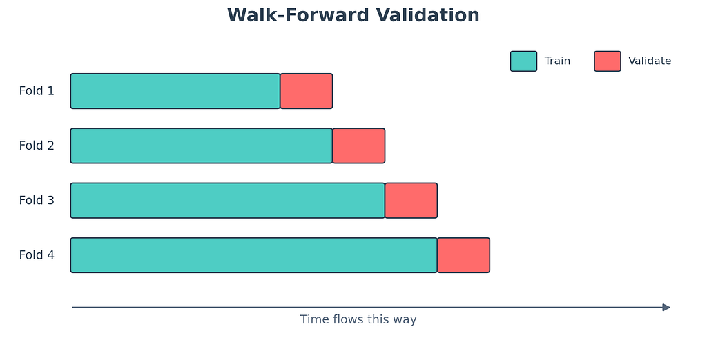
Walk forward validation. The only honest split.
The single most common mistake I see beginners make. Sklearn-style random k-fold cross validation. Don’t. Random splits leak the future into the past. You’ll see ridiculous metrics in development and humiliating ones in production.
The right way. Slide a window forward in time. Train up to time t. Validate on time t plus 1 to t plus h. Slide forward. Train up to time t plus h. Validate again. Repeat. This mirrors what your model will face in deployment, where it can only see the past.
# walk forward validation done by hand. yes, by hand. it is short and clear.
def walk_forward_eval(series, model_fn, initial_train=200, horizon=14, step=14):
    # rolls forward through the series
    # trains up to time t, predicts horizon steps ahead
    errors = []
    n = len(series)
    t = initial_train
    while t + horizon <= n:
        train  = series.iloc[:t]
        actual = series.iloc[t:t + horizon].values
        # train is everything up to time t
        # actual is the next horizon true values
        model = model_fn(train)
        pred  = model.forecast(horizon)
        # fit fresh on the growing training set
        # predict horizon steps
        err = mae(actual, pred)
        errors.append(err)
        t += step
        # slide forward by step, usually equals horizon
    return np.mean(errors), errors
There are two flavors. Expanding window grows the training set each iteration. Rolling window keeps the size constant and slides forward. Expanding is more common when you have plenty of data. Rolling is better when you suspect older data no longer represents the world (which is exactly the regime shift problem Zillow hit).
In modern code, scikit-learn’s TimeSeriesSplit handles this for you. So does Nixtla’s StatsForecast cross_validation method. Use the helpers. Don't reinvent.
Why this matters. The metrics you report in dev set the expectation in production. Honest evaluation is the only kind that survives contact with reality.
The graveyard of common mistakes
Tape stuck to my finger and I cannot get it off. These mistakes are similar. They follow you around for years. I’m going to rapid-fire the worst offenders.
Look-ahead bias. Using information at training time that wouldn’t have been available at prediction time. Computing a feature from future values, scaling using statistics from the entire series, training on data after the validation point. Always pretend you’re standing inside time.
Wrong train test split. Random shuffling instead of chronological. Death by sklearn habit. Just don’t.
Treating timestamps as just another feature. Time has structure. Day of week, month, holidays, distance to events. Decompose it.
Not handling missing timestamps. A series with gaps is not a series with shorter length. Reindex first. Decide on imputation. Then model.
Letting outliers dictate the trend. One Black Friday is not your trend. Detect, flag, sometimes winsorize, sometimes use a holiday regressor.
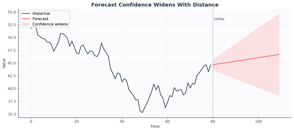
Overconfidence in confidence intervals. Most ARIMA confidence intervals assume Gaussian residuals. Real residuals are often fat tailed. Use bootstrapping or quantile loss for honest uncertainty.
Forecasting the wrong thing. A retailer cared about weekly revenue. We forecasted daily revenue and aggregated. Errors compounded. Forecast at the level your decision will be made.
Refusing to retrain. Models drift. The world changes. Zillow’s algorithm performed beautifully right up until the housing market shifted, at which point nobody had a retraining schedule that responded fast enough. Set up monitoring. Set up alarms. Schedule retraining.
Letting AutoML pick the model and walking away. Auto tools are great for a first cut. They’re terrible at noticing your data has a structural break in March 2020. Read the residuals. Read the plots. Auto, then audit.

Decision flowchart you can actually use
Here’s the flowchart that lives on my actual sticky notes above my monitor. The tape on it is yellowing. The advice still works.
Because the user asked nicely.
+---------------------------+----------------------------------+
| Situation                 | Default model                    |
+---------------------------+----------------------------------+
| Tiny data, no clear pattern| Seasonal naive                  |
| Clear trend, no seasonality| Holt linear or ARIMA(p,1,q)     |
| Trend plus seasonality    | Holt Winters or SARIMA           |
| Holidays, weather, events | SARIMAX or Prophet               |
| Many features, big data   | LightGBM or XGBoost              |
| Many parallel series      | StatsForecast or N-BEATS         |
| Long horizon, multivariate| Transformer or TimeGPT           |
+---------------------------+----------------------------------+
Pick the simplest thing that fits your problem. Resist the urge to start at the bottom of the table. The M5 results are the cautionary tale. Most people would have placed higher with the top row than with whatever they actually submitted.
A complete example you can run tonight
Plug your CSV in. Read every comment. This is the pipeline that has shipped the most code in my career.
# end to end forecasting pipeline. plug your CSV in. read every comment.
import pandas as pd
import numpy as np
import matplotlib.pyplot as plt
from statsmodels.tsa.stattools import adfuller
from statsmodels.tsa.statespace.sarimax import SARIMAX
#
# 1. load the data. assume CSV with two columns. date and value.
df = pd.read_csv('sales.csv', parse_dates=['date'])
df = df.set_index('date').sort_index()
# parse_dates makes pandas treat date as datetime
# index by date, sort because real CSVs lie about order
#
# 2. resample to monthly frequency. interpolate any gaps.
df = df.resample('M').sum()
df['value'] = df['value'].interpolate()
# M means month end, use D for daily, W for weekly
# interpolate fills missing months linearly
#
# 3. eyeball the series. always plot first. always.
df['value'].plot(title='Raw monthly series', figsize=(10, 4))
plt.show()
#
# 4. check stationarity with ADF. small p-value means stationary.
adf_stat, p_value, *_ = adfuller(df['value'].dropna())
print(f'ADF p-value: {p_value:.4f}')
#
# 5. split chronologically. last 12 months go to test.
train = df.iloc[:-12]
test  = df.iloc[-12:]
#
# 6. fit SARIMA. orders chosen by ACF/PACF inspection.
model = SARIMAX(
    train['value'],
    order=(1, 1, 1),
    seasonal_order=(1, 1, 1, 12),
    enforce_stationarity=False,
    enforce_invertibility=False,
)
fitted = model.fit(disp=False)
print(fitted.summary())
#
# 7. forecast 12 months ahead with confidence interval
forecast_obj  = fitted.get_forecast(steps=12)
forecast_mean = forecast_obj.predicted_mean
ci = forecast_obj.conf_int(alpha=0.05)
#
# 8. evaluate against the held out test set
mae_val  = np.mean(np.abs(test['value'].values - forecast_mean.values))
rmse_val = np.sqrt(np.mean((test['value'].values - forecast_mean.values) ** 2))
mape_val = np.mean(np.abs((test['value'].values - forecast_mean.values) / test['value'].values)) * 100
print(f'MAE  : {mae_val:.2f}')
print(f'RMSE : {rmse_val:.2f}')
print(f'MAPE : {mape_val:.2f}%')
#
# 9. plot the whole thing. train, test, forecast, confidence band.
fig, ax = plt.subplots(figsize=(12, 5))
ax.plot(train.index, train['value'], label='Train',    color='#2C3E50')
ax.plot(test.index,  test['value'],  label='Actual',   color='#FF6B6B')
ax.plot(forecast_mean.index, forecast_mean.values, label='Forecast', color='#4ECDC4')
ax.fill_between(ci.index, ci.iloc[:, 0], ci.iloc[:, 1], color='#4ECDC4', alpha=0.2, label='95% CI')
ax.legend()
ax.set_title('Monthly forecast vs actual')
plt.tight_layout()
plt.show()
If this prints sane numbers and the plot looks reasonable, you have just done time series forecasting end to end on your own data. The dopamine hit lasts about an hour. Print this script. Tape it to your wall.
What’s actually changed in 2026
The field has shifted in ways worth knowing if you came in expecting the textbook stack from five years ago.
Foundation models for time series are real now. TimeGPT from Nixtla. Lag-Llama from MILA. Chronos from Amazon. They’re pretrained on millions of series and can produce zero-shot forecasts on data they’ve never seen. Are they better than fine-tuned ARIMA on your specific series. Sometimes. Worth a benchmark.
Nixtla’s ecosystem has eaten a lot of the classical Python forecasting world. StatsForecast for classical methods. NeuralForecast for deep learning. MLForecast for boosted trees. HierarchicalForecast for reconciling many series at once. Their APIs are clean and they’re fast.
Darts is still the most beginner friendly multi-model wrapper. If you want to try ten methods on the same dataset in three lines of code, Darts is the move.
Probabilistic forecasting is the new accuracy. Point forecasts are losing ground to quantile forecasts and prediction intervals. Real businesses care more about “how bad could it get” than “what’s the most likely number”.
The M6 competition (financial forecasting) found a counterintuitive result. Models that forecast accurately did not necessarily make better investment decisions. Forecasting accuracy and decision quality are not the same skill. Worth remembering.
FAQ:
Can I use ARIMA on stock prices to get rich? No. Markets are too efficient and too noisy. ARIMA will pick up structure that isn’t there and you’ll lose money confidently.
How much data do I need? Rough rule. At least two full seasonal cycles, ideally five. For monthly data with yearly seasonality, that’s two to five years.
My series has zeros and missing values, what do I do? Reindex to a complete frequency first. Decide on imputation. For zero-inflated demand, consider Croston’s method or a zero-inflated regression.
Should I log transform? If your series has multiplicative seasonality and right skew, yes. Log first, model the log series, exponentiate the forecast back. Track the transform when computing intervals.
XGBoost or LSTM? XGBoost first, almost always. LSTM only if XGBoost fails to capture patterns and you have enough data to train a network without overfitting.
My model is great in dev but terrible in production. What’s wrong? Almost always one of three things. Data leakage during feature engineering. Distribution shift between train and serve. A wrong train-test split that masked overfitting. Reread the mistakes section.
Should I use TimeGPT or roll my own? Try TimeGPT first as a baseline. If it’s competitive with your custom model and you don’t need to explain coefficients to a regulator, ship TimeGPT. If you do need explainability or you have weird domain features, roll your own.

One paragraph I’d tape to my younger self’s monitor
Plot before you fit. Difference before you assume. Benchmark against naive before you cheer. Split chronologically and never randomly. Read residuals like they’re a diary written about your model’s bad behavior. Pick metrics that match the business decision. Believe the simple model first, the fancy model second. Never confuse a confidence interval for a guarantee. When the deadline is tomorrow, Holt Winters is your friend. When you start hearing that the model has been “performing great in production” for six months, retrain it before something breaks. Zillow forgot that one and it cost them 9 billion dollars.
The dog wants a walk. He’s been patient. We’re done.
Glossary you can screenshot for the interview
+-------------------+-----------------------------------------------+
| Term              | Plain English meaning                         |
+-------------------+-----------------------------------------------+
| Trend             | Slow drift up or down                         |
| Seasonality       | Pattern that repeats on a fixed period        |
| Residual          | Whatever's left after trend and seasonality   |
| Stationary        | Stats stay roughly constant over time         |
| Differencing      | Subtract previous value to remove trend       |
| AR(p)             | Today depends on previous p values            |
| MA(q)             | Today depends on previous q errors            |
| ARIMA(p, d, q)    | AR plus differencing plus MA combined         |
| SARIMA            | ARIMA with seasonal terms added               |
| SARIMAX           | SARIMA with exogenous regressors              |
| ACF               | Correlation with lagged self at each lag      |
| PACF              | Direct correlation, holding all middle lags out|
| ADF test          | Statistical test for stationarity             |
| Holt Winters      | Exponential smoothing with trend and season   |
| Prophet           | Bayesian additive forecast model from Meta    |
| MAE, RMSE, MAPE   | Different ways to measure how wrong you are   |
| MASE              | Wrongness scaled by naive forecast wrongness  |
| Walk forward CV   | Train, validate, slide, repeat                |
| TimeGPT           | Foundation model for time series from Nixtla  |
| LightGBM          | The boosted tree library that won M5          |
+-------------------+-----------------------------------------------+
If you read this end to end, congratulations, you now know more applied time series than half the data scientists currently shipping models to production. The other half learned from the same mistakes I did. Maybe say hi. We’re a friendly bunch once you mention you read about Zillow.
Time Series Made So Easy My Aunt Got It on the Second Read was originally published in Towards AI on Medium, where people are continuing the conversation by highlighting and responding to this story.