Do Similar TikTok Captions Get Similar Engagement? A Data-Driven Investigation with 22,647 Posts
The Question Nobody Is Asking
Most TikTok analytics projects start with the same ambition: predict how many views a post will get from its caption. It sounds like a reasonable goal. Take the text, feed it into a model, get an engagement score. Except it almost never works — and there is a good reason for that.
Engagement on TikTok is driven overwhelmingly by factors that have nothing to do with the caption. The audio track, thumbnail, creator's follower count, time of posting, and above all, the platform's own recommendation algorithm, which decides whether a video reaches 500 people or 5 million. Caption text is one signal among many, and not the loudest one.
But there is a different question — a more interesting one — that text can answer. Not "how much engagement will this post get?" but rather: do posts with similar captions tend to get similarly patterned engagement? The distinction is subtle but important. One is a prediction problem. The other is a structural one. And when that structural question was tested across 22,647 TikTok posts, four engagement metrics, three neighborhood sizes, and twelve independent statistical tests, the answer came back unambiguous: yes, they do.
That finding turns out to be practically useful. It means a hashtag recommendation system can be built on top of it — one where every suggestion traces back to real posts, not black-box predictions.
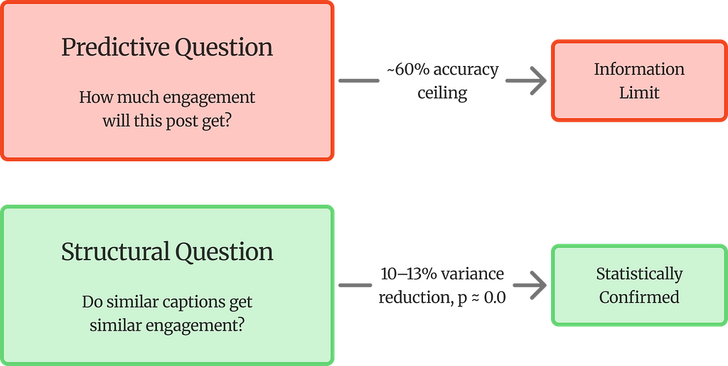
The project reframes the problem. Prediction from text alone hits a ceiling. The structural question has a clear answer.
Why Engagement Prediction Fails (and What to Ask Instead)
To understand why the structural question matters, it helps to see the prediction approach fail first.
Four classifiers were trained on binary engagement labels (high vs low, split at the median): Logistic Regression on SBERT embeddings, Multinomial Naive Bayes on TF-IDF features, and K-Nearest Neighbors at k=5 and k=10. All four converged at 59–60% accuracy. Given that the baseline (random guessing with balanced classes) is 50%, the models are doing something — but barely.
The telling detail is the convergence. Dense semantic features (SBERT, 384 dimensions) and sparse lexical features (TF-IDF, 10,000 dimensions) both hit the same wall. If the richer semantic representation of SBERT offered a genuine predictive advantage over keyword frequencies, there should be a gap. There is not. This points to an information ceiling — caption text, regardless of how it is encoded, does not contain enough signal to reliably predict engagement on TikTok.
That ceiling is not a failure of the project. It is actually its most important setup. Because the question being asked is not about prediction — it is about structure. Specifically:
Do semantically similar TikTok captions form neighborhoods with lower within-group engagement variance than random groups of equal size?
Framed as a hypothesis test:
- H₀ (Null): Within-group variance in semantic neighborhoods is not significantly lower than in random groups of equal size — semantic proximity carries no engagement signal.
- H₁ (Alternative): Semantic neighborhoods have significantly lower within-group variance — posts that mean similar things perform more consistently than chance would predict.
If text cannot predict engagement levels, but semantically similar posts still perform more consistently than random groups, then H₀ can be rejected. But what does that actually look like?
Pick any TikTok post about gym workouts. Now pull the five posts with the most similar captions. If those five posts happen to have view counts that are closer to each other than five random posts would — not necessarily high, just closer together — that is the pattern. The text does not tell you whether a post will go viral. But it does tell you that posts talking about similar things tend to land in a similar engagement range, more often than chance alone would explain.
The prediction ceiling makes this finding stronger, not weaker — because the consistency cannot be explained by the models simply learning to separate engagement classes.
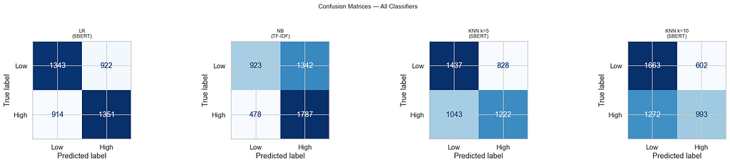
A confusion matrix shows how a classifier’s predictions line up against reality. Each row is the true label, each column is what the model predicted. The diagonal cells (top-left, bottom-right) are correct predictions; the off-diagonal cells are mistakes.
What stands out across all four matrices is how much blue fills the off-diagonal — roughly 40% of posts in each class are misclassified, no matter the model. Naive Bayes (NB) is especially lopsided: it catches most high-engagement posts (1,787 correct) but misses a majority of low-engagement ones (1,342 predicted as high). It is essentially biased toward predicting “high.” KNN at k=10 has the opposite problem — it over-predicts low engagement. Logistic Regression is the most balanced, but still stuck at 59%.
The key takeaway is not any single model’s behavior. It is the convergence. Four different models, two different feature representations (dense SBERT vs sparse TF-IDF), and they all land in the same 59–60% range. That is the information ceiling — and it is what makes the variance reduction results in the next sections meaningful rather than trivial.
The Full Pipeline at a Glance
Before diving into details, here is the end-to-end architecture:

The Dataset: 22,647 TikTok Posts
The data comes from a custom TikTok scraper that stored posts in a PostgreSQL database on Supabase. Four normalised tables capture the structure: `videos` (caption, timestamp), `video_snapshots` (likes, comments, plays, shares), `video_hashtags` (bridge table), and `hashtags` (tag strings). A SQL CTE joins them and pulls the most recent engagement snapshot per video.
The raw dataset has 26,623 posts. After dropping 3,976 posts (14.9%) whose captions had fewer than four non-hashtag characters — essentially posts that were nothing but hashtag strings with no real text — 22,647 remain.
The Hashtag Coverage Crisis
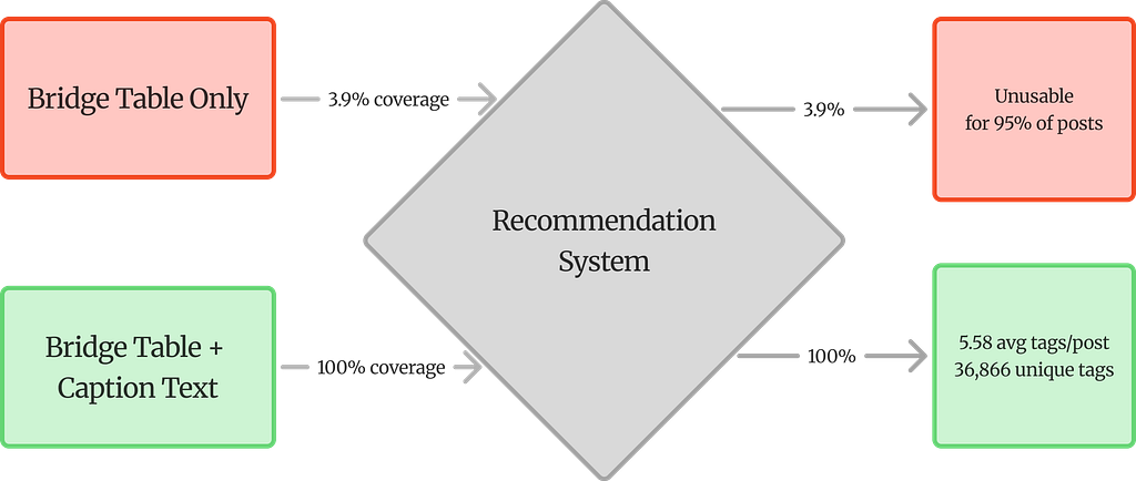
One discovery during data exploration changed the entire pipeline. The bridge-table hashtag field covered only 3.9% of posts — 883 out of 22,647. A recommendation system built on that alone would be useless for over 95% of the corpus.
The fix was a two-phase extraction: pull hashtags from both the bridge table and inline caption text (the `#fitness`, `#gymtok` strings embedded in captions). After combining both sources, coverage jumped to 100% — an average of 5.58 tags per post across 36,866 unique hashtags. This is not a preprocessing nicety. Without it, the recommendation task would be impossible.
The two-phase hashtag extraction was the single most impactful pipeline fix.
Taming the Engagement Distribution
Raw engagement counts on TikTok follow extreme power-law distributions — a few viral posts with millions of views, and a long tail of posts with a few hundred. Log-transformation compresses this:
y’ = log(1 + y)
In practice, a post with 500,000 views becomes y’ = 13.12, while one with 1,000 views becomes y’ = 6.91. The “+1” inside the log handles posts with zero engagement on a given metric. Binary engagement labels were created by splitting at the median of log-transformed views (13.06), producing a perfectly balanced 50/50 split.
How Captions Become Vectors
The core idea is simple: turn each caption into a fixed-size numerical vector, so that captions with similar meaning end up with similar vectors. Two representations were used, each capturing something different.
SBERT: Meaning as Geometry
Sentence-BERT (`all-MiniLM-L6-v2`) maps each caption to a 384-dimensional vector. The model is trained so that semantically similar sentences land close together in this high-dimensional space. Similarity is measured by cosine similarity — essentially, the angle between two vectors:
sim(u, v) = (u · v) / (||u|| × ||v||)
What this does is compare the direction two vectors point in, ignoring their magnitude. A caption like “Just hit a new personal record at the gym” and one like “Smashed my fitness goals today” share almost no words, but SBERT should produce vectors pointing in roughly the same direction — because the meaning is similar. All vectors are L2-normalised (unit length), so the dot product directly equals cosine similarity.
Why Hashtags Must Be Removed First
This is a critical design decision. Hashtags are extracted before cleaning — to serve as ground truth for recommendation — and then stripped from the text before SBERT encoding. Without this step, the model would learn hashtag-string similarity instead of topical similarity. Two posts tagged `#fitness` would look similar even if one is about weightlifting and the other about running shoes. The hashtag is the label, not the feature.
TF-IDF: The Sparse Counterpart
A TF-IDF matrix (22,647 × 10,000, bigrams, sublinear term frequency) captures lexical patterns. Emojis — which carry real semantic weight on TikTok — are first converted to text tokens (e.g., flexed_biceps) via demojisation so that TF-IDF can count them. Having both dense (SBERT) and sparse (TF-IDF) representations matters because their convergence at the same accuracy ceiling is what confirms the information limit.
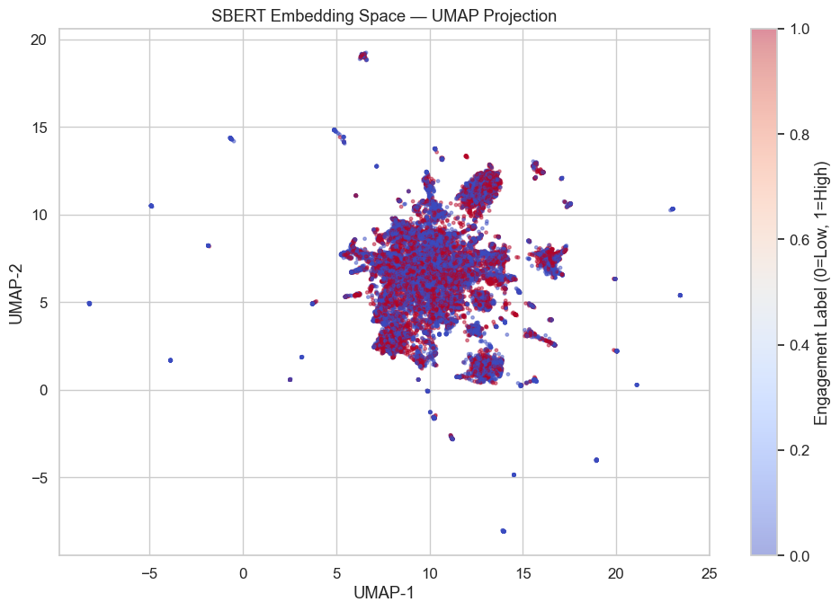
What the Embedding Space Looks Like
A UMAP projection of the 384-dimensional embeddings down to 2D reveals a dense central cluster with scattered outliers — typical for a short-text corpus covering many topics. The important observation: high- and low-engagement posts are thoroughly intermixed. There is no visible boundary between them. The embedding space captures topical structure, but engagement level is not something it can partition.
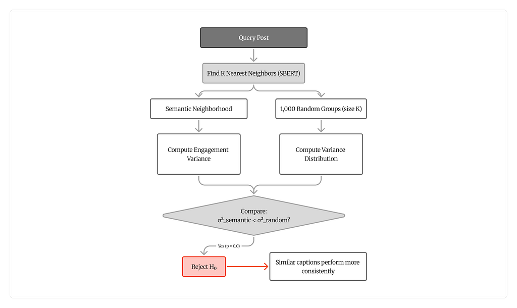
Building Semantic Neighborhoods
The analysis hinges on a straightforward idea: for each of the 22,647 posts, find its K most similar posts in embedding space and check whether their engagement metrics are more consistent than in random groups.
The KNN Index
FAISS (Facebook AI Similarity Search) builds an exact cosine search index over the normalised embeddings. For each post, the K nearest neighbors are retrieved at K = 5, 10, and 20. The query post is excluded from its own neighborhood.
At K=5, only the five most similar posts are included — tight topical overlap, likely overlapping audiences. At K=20, the boundary expands to include more distant posts. If a real semantic-engagement relationship exists, variance reduction should be strongest at K=5 and decay as K grows. That decay turns out to be one of the strongest pieces of evidence.
The Variance Comparison Framework
For each post’s semantic neighborhood, the within-group variance of each log-transformed engagement metric is computed. Then 1,000 random groups of the same size K are drawn from the corpus, and their variances form a null distribution. The question: does the semantic neighborhood consistently land on the low end?
Variance reduction quantifies this:
Δσ² = (σ²_random − σ²_semantic) / σ²_random × 100%
A positive value means semantic neighborhoods have lower engagement variance than random groups — posts that mean similar things perform more consistently.
Statistical Testing
The one-sided Mann-Whitney U test checks whether the distribution of semantic neighborhood variances is stochastically smaller than the distribution of random group variances. This is a non-parametric test — it does not assume normality, which matters because engagement distributions on social media are notoriously heavy-tailed. Levene’s test adds a second layer by checking whether the two distributions differ in spread.
The Results: What the Numbers Say
Every single test came back significant.

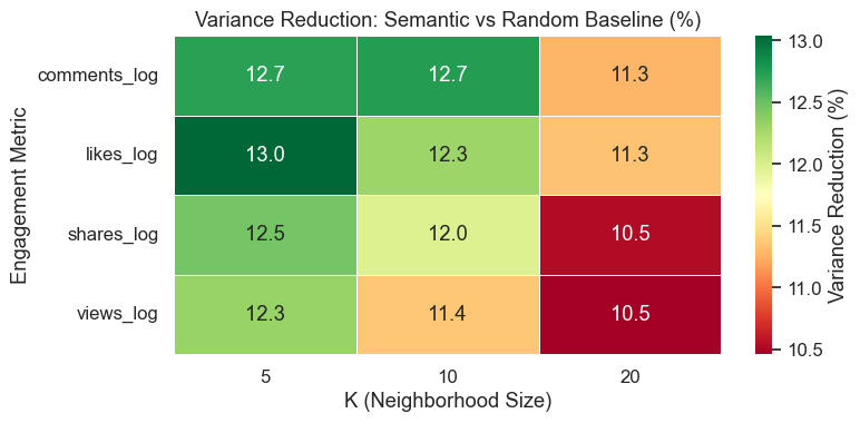
All twelve Mann-Whitney U tests returned p ≈ 0.0. The effect is consistent across all four engagement metrics and all three neighborhood sizes.
Here is what these percentages mean in practice. Take the 13.04% for likes at K=5. For any given post, its five most semantically similar neighbors have like counts that spread about 13% less than five randomly picked posts would. In concrete terms: if five random TikTok posts might have log-likes ranging from 5 to18 (a huge spread), five semantically similar posts would have that spread compressed — say, from 8 to16. The engagement is not identical, but it clusters tighter. That 13% is the difference between “random noise” and “meaningful pattern.”
And the p ≈ 0.0 means this is not a fluke. With 22,647 neighborhoods tested at each K value, the statistical power is enormous. The probability of seeing this pattern by chance is effectively zero.
Why the Numbers Get Smaller as K Grows
Variance reduction decreases as K grows: roughly 12.6% at K=5, dropping to about 10.9% at K=20. This is not a weakness in the results — it is actually one of the strongest pieces of evidence.
Think about it this way. At K=5, only the five most similar posts are included. These are captions that are genuinely about the same topic, written in a similar style, likely reaching overlapping audiences. The engagement consistency is strong because the similarity is strong. At K=20, the neighborhood has to stretch further. Post number 15 or 18 in the similarity ranking is still somewhat related, but it might be a slightly different angle on the same topic, or a different content style. The semantic glue is weaker, so the engagement consistency weakens too.
This decay is exactly what should happen if the relationship between meaning and engagement is real. If the variance reduction stayed flat regardless of K, that would be suspicious — it would suggest the effect comes from something other than semantic similarity. The fact that it tracks tightly with how similar the neighbors actually are is what makes the evidence convincing.

A Deeper Look: Not Just Averages, but Distributions
Levene’s test adds a layer beyond the averages. At K=5, the difference between semantic and random neighborhoods is mainly about where the center sits — semantic neighborhoods have lower average variance, but the shape of the distribution is similar. At K=10 and K=20, something more interesting happens: the distributions themselves become significantly different in shape (p < 0.05). Semantic neighborhoods are not just shifted to the left on the variance scale — they are also more tightly concentrated. Random groups produce a wide, unpredictable spread of variance values. Semantic groups are more predictable even in how variable they are.
Connecting the Two Analyses
The 59–60% accuracy ceiling from the classification baselines is not a separate result — it is essential context for interpreting the variance reduction.
Here is the logic. If classifiers could cleanly separate high- from low-engagement posts using text features, then the variance reduction might have a trivial explanation: similar captions would land in the same class, and posts within a class naturally have more similar engagement than posts across classes. The variance reduction would just be measuring class clustering, not anything about meaning.
But the classifiers cannot separate the classes. Dense features (SBERT) and sparse features (TF-IDF) both hit the same wall. Text does not predict engagement level. And yet — semantically similar posts still perform more consistently than random groups. That means the consistency is not coming from class membership. It is coming from something in the semantic structure itself. The prediction failure is what rules out the trivial explanation and leaves the interesting one standing.
Turning Structure into Recommendations
That consistency pattern has a direct practical application: hashtag recommendation.
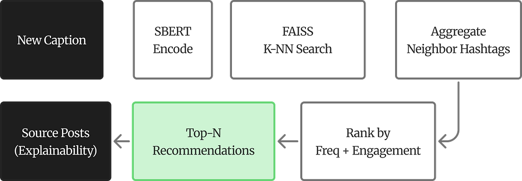
How It Works
Given a new caption, the system encodes it with SBERT, retrieves its K nearest neighbors from the corpus, aggregates the hashtags used by those neighbors, and ranks them by two criteria: how often each hashtag appears among the neighbors (frequency) and the average log-engagement of posts carrying that hashtag.
def recommend_for_new_caption(raw_caption, model, corpus_embeddings, df, K=10):
    # 1. Encode the new caption with SBERT
    # 2. Find K nearest neighbors via FAISS cosine search
    # 3. Aggregate hashtags from neighbor posts
    # 4. Rank by frequency + average log-engagement
    # 5. Return recommendations with traceable source posts
What the Output Looks Like
To make this concrete, here are three test captions fed into the system. Each one returns a ranked list of hashtag suggestions. Two numbers accompany each hashtag: Freq. is how many of the K nearest neighbors used that hashtag (higher = more topically relevant), and Avg. log-eng. is the average log-transformed engagement across posts in the neighborhood that carry that tag (higher = those posts tended to perform better).
The tables below show three test captions from different content verticals — fitness, finance, and food — each with its top recommended hashtags:
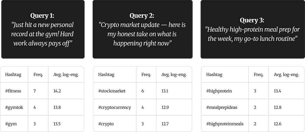
A few things to notice. For the gym caption, seven out of K neighbors used #fitness — it is the dominant tag in that semantic neighborhood. The 14.2 average log-engagement translates back to roughly 1.5 million raw views across those posts. #gymtok and #gym appear less frequently but still carry strong engagement signals.
The crypto query shifts the neighborhood entirely — the neighbors are now finance-oriented posts, and the hashtags reflect that. The engagement levels are slightly lower than the fitness vertical, which is simply what the data contains, not a flaw. The meal prep query has lower frequencies overall because the neighborhood is more niche. Fewer neighbors converge on the same tags, which is expected when the topic has less content density in the corpus.
The pattern across all three is the same: the system finds posts that mean similar things, looks at what hashtags those posts actually used, and ranks them by how common and how well-performing they are within that neighborhood.
What Makes This Different
The system does not hallucinate. Every recommendation points to specific real posts in the corpus. A user can inspect which similar posts led to a given suggestion and what engagement those posts received. The explainability is built into the mechanism, not bolted on after the fact. A caption about “crushing it at the gym” would still get fitness hashtags even if it never uses the word “fitness” — because SBERT encodes meaning, not keywords.
Limitations and What Comes Next
No analysis is complete without an honest accounting of its boundaries.
The 59–60% accuracy ceiling underlines that engagement on TikTok is overwhelmingly driven by non-textual factors — audio, visuals, follower count, posting time, algorithmic amplification — none of which appear in the data. The SBERT model (`all-MiniLM-L6-v2`) was trained mainly on English, so it likely underperforms on TikTok’s substantial multilingual and slang-heavy content. Variance reduction varies with K (10.5–13%), meaning practitioners need to calibrate based on how tight they want their neighborhoods. The dataset is a static snapshot — adding new posts requires rebuilding the entire FAISS index. And dropping 14.9% of posts for having minimal captions introduces a bias toward descriptive content.
The most impactful next step would be incorporating multimodal signals: audio embeddings, thumbnail features, and video-level representations. Pushing beyond the text-only ceiling requires looking at what the text cannot see. Multilingual embedding models would broaden the system’s reach to TikTok’s global audience. Incremental indexing through FAISS IVF partitions would make real-time updates feasible. And the strongest validation would come from A/B testing: deploying recommended hashtags on live posts and measuring whether they actually influence engagement outcomes.
The Takeaway
The instinct in most engagement-analysis projects is to predict magnitude — how many views, how many likes. On TikTok, that is largely a losing game for text-only approaches. But the structural question — do similar captions perform similarly? — has a clear, statistically robust answer: yes. Variance reductions of 10–13%, consistent across every metric and neighborhood size, with p ≈ 0.0 across all twelve tests.
That regularity is not just academically interesting. It provides the foundation for a recommendation system that is transparent, traceable, and grounded in real data. No black box. No hallucination. Every suggestion backed by actual posts that share meaning and performance characteristics with the query.
The code, data, paper and full analysis are available on GitHub:
Do Similar TikTok Captions Get Similar Engagement? A Data-Driven Investigation was originally published in Towards AI on Medium, where people are continuing the conversation by highlighting and responding to this story.