How to join LLM traces with billing, infrastructure, and customer data using Iceberg and BigQuery
If you run AI agents in production, you’ve probably run into a simple problem: you can’t answer basic questions about them in SQL. Your traces and evaluations live in your observability platform. Billing data lives in BigQuery. Infrastructure metrics live in INFORMATION_SCHEMA,. Customer and revenue data live in your warehouse.
Each system answers part of the story, but you can’t easily join them. That means you can’t write queries like:
SELECT

  prompt_template,

  SUM(total_cost) AS cost,

  AVG(eval_score) AS quality

FROM arize_traces

GROUP BY prompt_template;
Most teams simply don’t have their trace data available in a warehouse to run queries like this.
As a result, answering seemingly straightforward questions becomes difficult: Which prompts drive the most cost? Which agent behaviors correlate with customer satisfaction? Are performance issues caused by the model or by infrastructure constraints? Without a unified dataset, these questions require manual stitching across systems, if they can be answered at all.
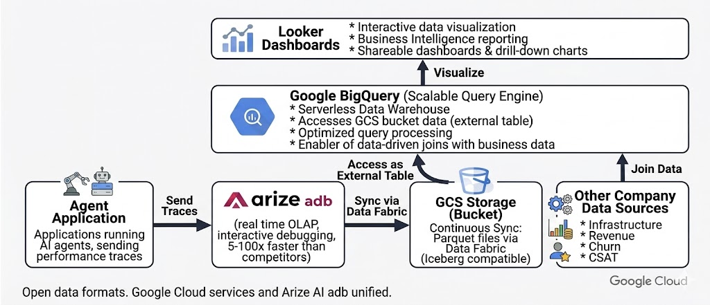
Arize Data Fabric, together with Google BigQuery, close this gap by continuously syncing agent traces to open Apache Iceberg tables that can be queried alongside billing, infrastructure, and customer datasets. This makes it possible to trace a line from an agent’s reasoning to its cost and business impact.In this post, we’ll outline architecture, show the SQL queries this enables, and share insights from a production-scale enterprise support agent running on Vertex AI.
Agent traces as warehouse data
Traditional software systems produce logs and metrics that indicate whether a system is healthy. AI agents generate a richer form of telemetry: structured operational data describing how decisions are made. This includes which context was retrieved, which tools were invoked, how many tokens were consumed, and how evaluators scored the result.
In practice, this data behaves like a warehouse table with one row per span or session and typed columns such as:
session_idprompt_templatellm.token_countllm.costtool.namelatency_mseval.score
As Arize CEO Jason Lopatecki recently wrote, “these traces are not ephemeral telemetry. They are durable business artifacts that customers want to retain, analyze, and feed back into downstream systems.”
Once available in a warehouse, this data can be queried alongside other operational datasets:
SELECT

  session_id,

  tool_name,

  latency_ms,

  eval_score

FROM arize_traces

WHERE eval_score < 0.7;
Treating agent traces as structured warehouse data allows engineering and data teams to analyze agent behavior using the same tools and workflows they already rely on.
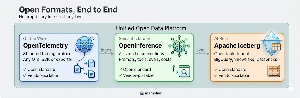
Arize’s open data format vision
One of the core design principles behind Arize is that your AI observability data should never be locked in. Agent traces, evaluations, and annotations are first-class business data.
Arize’s datastore, adb, is built around the Apache Iceberg format. When Data Fabric is enabled, trace data is written as Parquet files with Iceberg metadata in your cloud storage bucket. These files are natively readable by BigQuery, Snowflake, Databricks, and Spark.
This matters for three reasons:
No vendor lock-in. Your trace data sits in standard Parquet files in any cloud storage bucket such as Google Cloud Storage (GCS), organized with Iceberg metadata. BigQuery reads it as an external table. If you later move to Snowflake or Databricks, the same files work there too. You’re never exporting, converting, or migrating. The data is already in a format every major warehouse understands.
Evaluations and annotations travel with the data. When your team runs a new evaluation on a three-month-old trace—say re-scoring historical interactions with an updated LLM-as-a-judge evaluator—that annotation syncs to your warehouse in the next 60-minute window. This ensures your warehouse reflects your current observability state.
Schema fidelity via OpenInference. Columns follow OpenInference semantic conventions, such as:
llm.token_countllm.costtool.nameprompt.templatesession_ideval.score
These typed fields enable efficient filtering, aggregation, and joins without relying on unstructured JSON blobs.
Partitioning for efficient queries. Tables are typically partitioned by timestamp and project, allowing queries such as:
SELECT

SELECT *

FROM arize_traces

WHERE timestamp >= TIMESTAMP_SUB(CURRENT_TIMESTAMP(), INTERVAL 7 DAY);
to scan only recent data, reducing both latency and query cost.
Why this approach is unusual
In many AI observability systems:
- Trace data is stored in proprietary formats.
- Exports are batch-oriented or limited to aggregated views.
- Joining traces with warehouse datasets requires custom pipelines.
As a result, teams struggle to answer questions like: which customers generate the most expensive agent sessions?
By synchronizing traces directly into open Iceberg tables, Data Fabric enables standard SQL-based analysis without additional data engineering effort.
The engine behind it: adb and Data Fabric
Under the hood, Arize’s observability architecture is intentionally split into two layers that work together:
- adb which is a purpose-built OLAP engine optimized for real-time exploration of AI telemetry.
- Data Fabric which offers a persistence and synchronization layer that mirrors this data into open Iceberg tables within your cloud storage
Why adb?
AI telemetry differs significantly from traditional logs:
- Nested spans (agent to tool to LLM)
- High-cardinality dimensions (prompt templates, models, tools)
- Large text payloads (prompts and responses)
adb is optimized for these characteristics, enabling interactive analysis across billions of spans. For example:
SELECT

  prompt_template,

  tool_name,

  AVG(eval_score) AS avg_quality

FROM arize_traces

GROUP BY prompt_template, tool_name;
In benchmarks, adb has demonstrated from 2.7x to 176x better performance than competitor analytical systems across both bulk uploads and real-time ingestion. It handles terabytes per day of AI telemetry across billions of spans while maintaining interactive query latency. Tasks that used to be impractical, like running multi-dimensional cuts over long time windows across all agents and models, become routine.
Read the full adb benchmark results >
Together, adb and Data Fabric provide both low-latency debugging capabilities and an open, continuously updated system of record in your warehouse.
Why Google BigQuery Is a natural partner
Google Cloud customers already store billing, infrastructure, and business data in BigQuery. Data Fabric makes it possible to analyze agent behavior within this existing ecosystem.
Billing data
Cloud billing data export lets you export detailed Google Cloud billing data (such as usage, cost estimates, and pricing data) automatically throughout the day to a BigQuery dataset. It contains line-item costs for every service: Vertex AI inference, BigQuery compute, Cloud Storage, broken down by SKU, timestamp, project, and resource labels. This is the financial ground truth for “how much are we spending on AI.”
Information metrics
INFORMATION_SCHEMA exposes BigQuery’s own infrastructure metadata about job execution times, slot utilization, bytes processed, reservation assignments. This is the infrastructure ground truth for “are we running efficiently.”
Creating an external Iceberg table
Arize trace data can be queried in BigQuery using a single DDL statement:
CREATE EXTERNAL TABLE `project.dataset.arize_traces`

OPTIONS (

  format = ‘ICEBERG’,

  uris = [‘gs://bucket/path/metadata/latest.metadata.json’]

);
Operational considerations
- No ingestion pipeline or ETL is required.
- External tables may have slightly higher latency than native tables.
- Partition pruning minimizes data scanned.
- Frequently accessed subsets can be materialized into native BigQuery tables for dashboards and production analytics.
Once your Arize trace data lives as a BigQuery table, every join becomes a standard SQL statement. And Looker Studio connects directly to BigQuery, giving you interactive dashboards over the unified data without writing any application code.
Connecting agent behavior to business outcomes
Consider an enterprise customer support agent running on Vertex AI. The agent 10k+ sessions monthly and handles order status checks, refunds, account updates, and escalations using multiple prompt templates and tools. With Data Fabric, trace data is synchronized to a GCS bucket and exposed as an external BigQuery table.
The following examples illustrate the types of analyses enabled once trace data is available in the warehouse.
Insight 1: Prompt template A costs 2.7X more per decision
SELECT

  prompt_template,

  AVG(llm_token_count) AS avg_tokens,

  SUM(llm_cost) AS total_cost

FROM arize_traces t

JOIN billing_export b

  ON DATE(t.timestamp) = DATE(b.usage_start_time)

GROUP BY prompt_template;
Template A averages 2,228 tokens per call versus Template B’s 1,520. Template A uses a longer system context and triggers more tool calls per interaction. Over 30 days, this adds up to $8.10 versus $3.67 in total inference cost, which is a 2.7x differential that is consistent every single day.
Engineering question answered: which design decisions are driving AI cost?
Executive question answered: Why is our AI spend increasing? Which design decisions are driving cost?
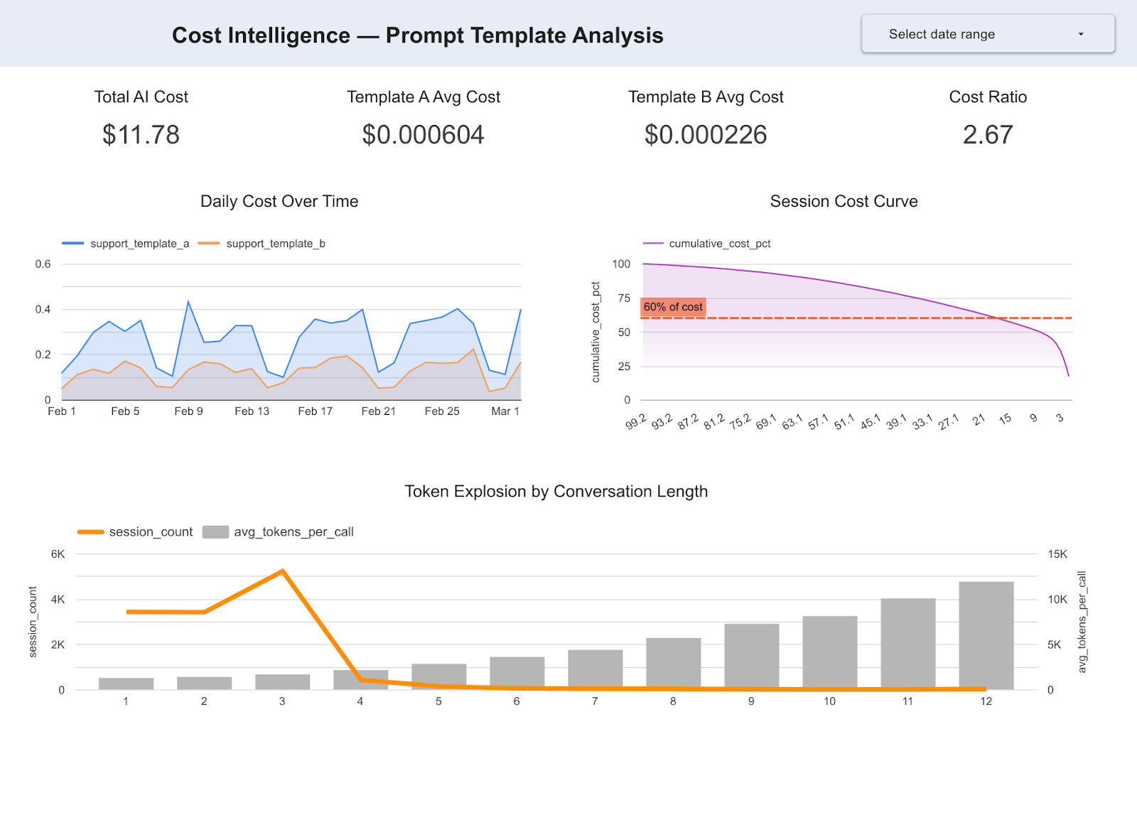
Insight 2: 20% of conversations drive 62% of compute spend
SELECT

  session_id,

  SUM(llm_cost) AS session_cost

FROM arize_traces

GROUP BY session_id

ORDER BY session_cost DESC;
longer conversations where full context is repeatedly included.
Engineering question answered: where are the highest-leverage opportunities for cost optimization?
Executive question answered: Are we scaling efficiently? Where is the highest-leverage cost optimization?
Insight 3: 25% of latency spikes are infrastructure-driven
SELECT

  EXTRACT(HOUR FROM t.timestamp) AS hour,

  AVG(t.tool_latency_ms) AS avg_tool_latency,

  AVG(j.total_slot_ms) AS avg_slot_usage

FROM arize_traces t

JOIN `region-us`.INFORMATION_SCHEMA.JOBS j

  ON DATE(t.timestamp) = DATE(j.creation_time)

GROUP BY hour

ORDER BY hour;
We joined trace latency data with BigQuery’s INFORMATION_SCHEMA job metadata. LLM span latency stays rock-steady at around 800ms across all 24 hours. The model is not degrading, but tool latency spikes 4X during business hours, between 9AM and 6PM. Those spikes correlate almost perfectly with BigQuery slot contention. 25% of all high-latency spans are infrastructure-driven, not model-related.
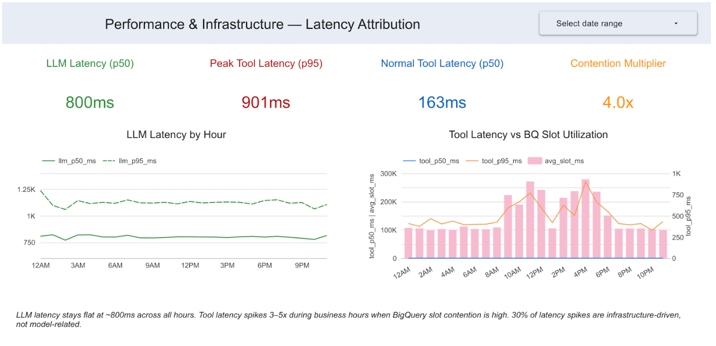
Engineering question answered: Should performance optimizations focus on the model or infrastructure?
Executive question answered: Are performance issues model-related or infra-related? Where should engineering invest?
Insight 4: At-risk customers consume disproportionate AI resources
SELECT

  c.customer_segment,

  SUM(t.llm_cost) / SUM(c.arr) AS ai_spend_per_arr

FROM arize_traces t

JOIN crm_customers c

  ON t.customer_id = c.customer_id

GROUP BY c.customer_segment;
At-risk SMB customers exhibit the highest AI spend relative to revenue. Additional joins with CSAT data reveal that lower evaluation scores correlate with decreased customer satisfaction.
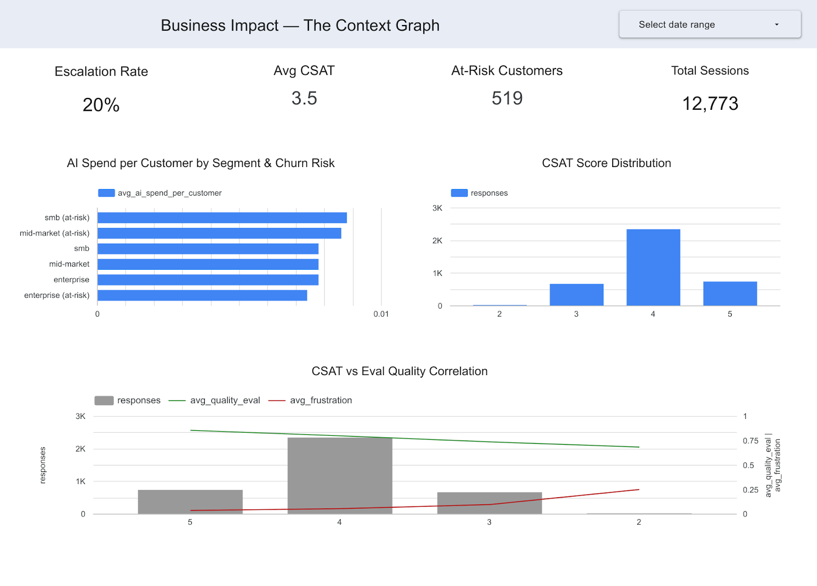
Arize can tell you which sessions had low eval scores. The CRM can tell you which customers are at risk of churning. Only the join tells you that you’re spending disproportionate AI resources on at-risk customers and getting low satisfaction in return, a finding that changes resource allocation strategy.
Engineering question answered: Are AI resources being allocated effectively across customer segments?
Executive question answered: Which AI decisions are driving business impact? Are we getting ROI from our AI spend across customer segments?
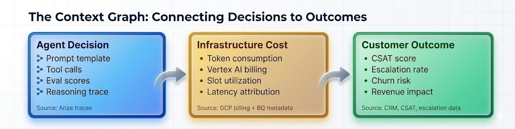
From observability to business intelligence
Once trace data resides in the warehouse, it becomes part of the same analytical workflows as billing, infrastructure, and customer datasets. Each insight follows a consistent pattern:
- Agent decision data from Arize traces via Data Fabric
- Operational or financial data from BigQuery
- Actionable insights via SQL joins
Analytical progression
Phase 1: Operational intelligence. Join traces with billing and infrastructure metadata to find out which prompts cost the most, where there are latency bottlenecks, and which sessions consume the most resources. These are findings an AI engineering team can act on immediately.
Phase 2: Business intelligence. Layer in CRM data, customer outcomes, CSAT scores, and escalation records. This helps you:
- Correlate agent behavior with customer satisfaction.
- Analyze AI spend relative to revenue.
- Predict escalation and churn risks.
In practice, this is simply a set of joinable warehouse tables connecting agent behavior with operational and business outcomes. Foundation Capital recently described this pattern as a “context graph,” or a living record of decisions and consequences that becomes the enterprise’s institutional memory for how AI agents operate.
What this doesn’t solve
While Data Fabric makes trace data queryable, it does not automatically resolve data modeling challenges. Teams still need:
- Consistent session or user identifiers across systems.
- Clear attribution between agent interactions and business outcomes.
- Well-structured CRM and revenue data.
Without these, joins between traces and business datasets may be incomplete or ambiguous.
Getting started
Data Fabric is available for Arize Enterprise accounts. Setup typically takes about 15 minutes:
- Enable Data Fabric in Arize settings and point it at a GCS bucket.
- Create a BigQuery external table using the Iceberg metadata.
- Start joining. Your traces are now a table alongside billing, infrastructure, and business data. Write SQL. Build dashboards. Answer the questions leadership has been asking.
Operational considerations
- Data sync latency: Approximately 60 minutes.
- Storage costs: Scale with the volume of Parquet files.
- Query costs: Depend on the amount of data scanned.
- Performance optimization: Materialize frequently accessed subsets into native BigQuery tables.
Once configured, your agent traces become a first-class dataset in your warehouse—ready for SQL analysis, dashboarding, and integration with existing data workflows.
Additional resources
- Introducing adb: Arize’s AI-native datastore
- adb benchmark results
- Real-time database ingestion at scale with adb
- Data Fabric documentation
- How context graphs turn agent traces into durable business assets
Arize AI provides the AI observability and evaluation platform for enterprises building with LLMs and AI agents. Google BigQuery is a serverless, multi-cloud data warehouse with native Iceberg table support.
The post Data Fabric: Querying agent traces in BigQuery appeared first on Arize AI.