
It looked correct. The numbers matched. Stakeholders were happy. And then I looked closely enough to discover that everything was right on the surface and fundamentally broken underneath. Here’s the whole story.
The report had been running for four months before I found the problem.
Four months of Monday morning distributions to twenty-six people. Four months of the leadership team making decisions from it. Four months of me feeling quietly proud of what I’d built — a clean, well-labelled, fast-loading sales performance report with drill-throughs and slicers and a colour palette that didn’t make anyone wince.
It was a good report. The data model underneath it was not.
The way I discovered this was embarrassing, which is probably why it made such a lasting impression. A new analyst joined the team. On her second week, she was using my report to answer a question about regional sales, and she paused and said — with the careful phrasing of someone who has not yet learned that telling your senior colleague their work is wrong is politically complicated — “these regional totals don’t match what I’m seeing in the source system.”
I told her she was probably looking at different date ranges.
She wasn’t.
I told her there might be a filter applied she hadn’t noticed.
There wasn’t.
She was right. The regional totals in my beautiful, well-designed, stakeholder-approved report were wrong. Not wildly, dramatically wrong — wrong in the quiet way that’s actually more dangerous. Wrong by maybe three to five percent across some regions. Accurate enough to look plausible at a glance. Wrong enough to change conclusions.
I spent the next two days understanding exactly how wrong, and why. And what I found reshaped how I think about data modelling completely.
What the First Model Looked Like
Let me describe the original model, because the wrongness wasn’t obvious — it was architectural, and it required understanding the structure to see the flaw.
I had built a standard-looking star schema:
- A Sales fact table with order-level grain — one row per line item
- A DimDate date dimension
- A DimProduct product dimension
- A DimCustomer customer dimension
- A DimRegion region dimension
Clean. Textbook. Exactly what you’d find in any data modelling tutorial.
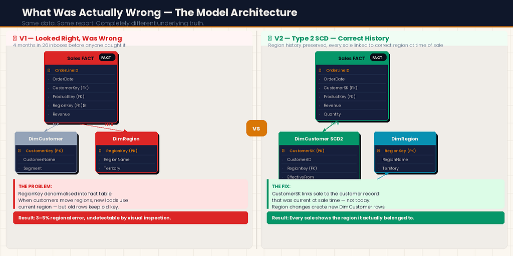
The problem was in how I’d connected DimRegion.
In our source system, Region was an attribute of the Customer — each customer belonged to a region, and that relationship lived on the customer record. But in my model, I had connected DimRegion directly to the Sales fact table using a RegionKey column I had added to the fact table during my ETL process.
I had denormalised the region into the fact table to “simplify the model.” This is something I’d seen done before. It seemed reasonable at the time.
Here’s what I hadn’t understood: some of our customers had changed regions during the four-month period. A handful had been reassigned to different sales territories. In the source system, the customer record was updated to reflect the new region. In my ETL process, I was joining the current customer table at load time — so new loads correctly reflected the current region.
But the historical sales rows in my fact table still carried the old RegionKey. When a customer moved from the North region to the South region in month three, their historical transactions stayed associated with North in the fact table — correctly, they happened when the customer was in North. Their new transactions from month three onwards were associated with South — also correctly.
Except that wasn’t what the report was actually calculating.
Because of how I’d set up the DAX measures and the relationship, the model was double-counting some transactions at regional level while undercounting others. The row-level data was correct. The aggregations across regions were not.
It wasn’t a loud failure. It was a quiet one. The kind that four months of stakeholders not noticing tells you was exactly calibrated to stay under the threshold of suspicion.
The Problem Was Deeper Than One Relationship
When I went looking for the root cause, I found it wasn’t just the region relationship that was wrong. That was the symptom that surfaced. The disease was that I had never clearly defined what question each layer of the model was supposed to answer.
In my first model, I had built what I needed to build to make the report look right. I had not built a model that correctly represented the business reality it was supposed to reflect.
These are different things, and the gap between them is where data model errors live.
What I had not asked myself when building the original model:
At what grain should this fact table sit? I knew it was order line items. But I had never explicitly written that down or thought through the implications. If the grain is order line items, every column in the fact table should describe the state of things at the moment of that order line — not the current state of related dimensions.
Which relationships are current-state and which are point-in-time? DimDate relationships are inherently point-in-time — a sale happened on a date and that date doesn't change. DimRegion via DimCustomer is current-state in our source system — the region attribute on the customer record reflects today's assignment, not the assignment at the time of the transaction.
What happens when dimension data changes? I had no answer to this question because I had not asked it. Slowly changing dimensions — the concept that dimension records can change over time and that your model needs a strategy for handling that — was something I’d heard of and promptly filed under “enterprise data warehousing concepts that don’t apply to my relatively small model.” They did apply. I just hadn’t looked closely enough.
The Rebuild: What I Did Differently
I spent three weeks rebuilding the model from scratch. I’m going to walk through the decisions that were different the second time, because those decisions are the ones worth understanding.

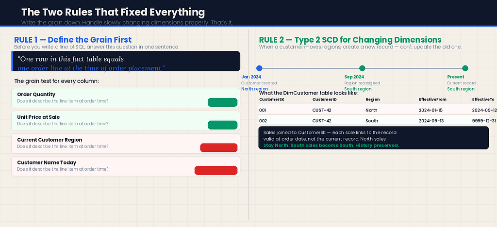
Decision 1: Define the grain explicitly before building anything
Before I wrote a single line of SQL or opened Power BI Desktop, I wrote this at the top of my design document:
“The Sales fact table sits at order line item grain. One row = one line on one order. Every column must describe the state of that line item at the time the order was placed.”
That sentence — written down, not just understood — changed every subsequent decision. When I asked “should this column go in the fact table or a dimension?” I had a test: does this attribute describe the state of the line item at order time, or does it describe something that might change?
Order quantity: Describes the line item. Fact table.
Unit price at time of sale: Describes the line item. Fact table.
Current customer region: Does not describe the line item. Does not go in the fact table.
Simple rule. Enormous difference.
Decision 2: Handle slowly changing dimensions properly
For the region problem specifically, I implemented a Type 2 Slowly Changing Dimension on DimCustomer.
In a Type 2 SCD, instead of updating a customer record when their region changes, you close the old record and create a new one:
-- Old approach: UPDATE (destroys history)
UPDATE DimCustomer
SET RegionKey = @NewRegionKey
WHERE CustomerKey = @CustomerKey

-- Type 2 approach: CLOSE old, OPEN new
UPDATE DimCustomer
SET EffectiveTo = GETDATE(), IsCurrent = 0
WHERE CustomerKey = @CustomerKey AND IsCurrent = 1

INSERT INTO DimCustomer (CustomerKey, CustomerName, RegionKey,
                          EffectiveFrom, EffectiveTo, IsCurrent)
VALUES (@CustomerKey, @CustomerName, @NewRegionKey,
        GETDATE(), '9999-12-31', 1)
Now DimCustomer has two rows for any customer who has changed regions: one for the period they were in the old region, one for the current period.
In the fact table, the CustomerSK (surrogate key) now correctly links each sale to the customer record that was current at the time of the sale — not the customer record that is current now.
This required rethinking the ETL join logic:
-- Old join (wrong): always gets current region
SELECT s.*, c.RegionKey
FROM SalesSource s
LEFT JOIN DimCustomer c ON s.CustomerID = c.CustomerKey AND c.IsCurrent = 1

-- New join (correct): gets the region that was current at sale time
SELECT s.*, c.RegionKey
FROM SalesSource s
LEFT JOIN DimCustomer c
    ON s.CustomerID = c.CustomerKey
    AND s.OrderDate >= c.EffectiveFrom
    AND s.OrderDate < c.EffectiveTo
The difference between these two joins is where the four-month error had lived.
Decision 3: One relationship, one direction, one purpose
In my first model, I had several bidirectional relationships set up because it had made some DAX measures easier to write. Bidirectional cross-filtering in Power BI looks like a harmless convenience. It is not.
When a relationship is bidirectional, filters can flow in both directions between two tables. This can produce unexpected results — particularly in models with multiple fact tables, bridge tables, or any situation where a filter on one table unexpectedly limits the values visible in another.
In the rebuilt model, I followed this rule: every relationship is single-direction unless there is an explicit, documented reason for it to be bidirectional.
I found I needed zero bidirectional relationships. The ones I’d set up originally were compensating for DAX I hadn’t been confident enough to write correctly.
Decision 4: Build a proper date dimension — not a calculated column
In my first model, I had extracted year and month from the OrderDate column using DAX calculated columns in the fact table. It worked. It was fragile, slow to load, and made time intelligence functions harder to write correctly.
In the rebuilt model, I built a proper date dimension table:
# In Fabric Notebook — generate a complete date dimension
import pandas as pd

def build_date_dim(start_date, end_date):
    dates = pd.date_range(start=start_date, end=end_date, freq='D')
    df = pd.DataFrame({'Date': dates})

    df['DateKey']         = df['Date'].dt.strftime('%Y%m%d').astype(int)
    df['Year']            = df['Date'].dt.year
    df['QuarterNum']      = df['Date'].dt.quarter
    df['Quarter']         = 'Q' + df['Date'].dt.quarter.astype(str)
    df['YearQuarter']     = df['Year'].astype(str) + ' ' + df['Quarter']
    df['MonthNum']        = df['Date'].dt.month
    df['MonthName']       = df['Date'].dt.strftime('%B')
    df['MonthShort']      = df['Date'].dt.strftime('%b')
    df['YearMonth']       = df['Date'].dt.strftime('%Y-%m')
    df['WeekNum']         = df['Date'].dt.isocalendar().week.astype(int)
    df['DayOfWeek']       = df['Date'].dt.dayofweek + 1
    df['DayName']         = df['Date'].dt.strftime('%A')
    df['IsWeekend']       = df['DayOfWeek'].isin([6, 7]).astype(int)
    df['IsMonthEnd']      = (df['Date'] == df['Date'] + pd.offsets.MonthEnd(0)).astype(int)
    df['FiscalYear']      = df.apply(
        lambda r: r['Year'] if r['MonthNum'] >= 4 else r['Year'] - 1, axis=1
    )  # April fiscal year start — adjust for your business

    return df

date_dim = build_date_dim('2020-01-01', '2027-12-31')
A dedicated date dimension makes every time intelligence DAX measure cleaner, more reliable, and more performant. DATESYTD, SAMEPERIODLASTYEAR, DATESINPERIOD — all of these work correctly against a proper date dimension. They work unpredictably against calculated columns.
Decision 5: Validate the model before building the report
In my first model, I had started building the report almost immediately after connecting the tables. I had validated it by looking at the report and checking whether the numbers “looked right.”
Numbers that look right are not numbers that are right.
In the rebuilt model, I built a validation layer before I opened the report canvas. Specifically:
A DAX measure that compared aggregated totals in my model against direct counts from the source system:
Validation - Revenue Match =
VAR ModelRevenue = [Total Revenue]
VAR SourceRevenue =
    CALCULATE (
        SUM ( ValidationTable[SourceRevenue] ),
        TREATAS ( VALUES ( DimDate[Date] ), ValidationTable[Date] )
    )
VAR Variance = ABS ( ModelRevenue - SourceRevenue )
VAR VariancePct =
    DIVIDE ( Variance, SourceRevenue, 0 ) * 100
RETURN
    IF ( VariancePct > 0.01, "⚠ MISMATCH: " & FORMAT(VariancePct, "0.00") & "%", "✓ MATCH" )
I ran this validation across every region, every month, every product category, before a single stakeholder saw the rebuilt report. Three discrepancies surfaced. Two were data quality issues in the source. One was a remaining error in my ETL logic that I fixed before going live.
The validation layer is now a permanent part of every model I build. It adds maybe half a day to a project. It has caught problems in three subsequent models that would have caused exactly the kind of quiet, four-month error I was trying to never repeat.
What the Rebuilt Model Made Possible
Here’s something I didn’t expect: the rebuilt model wasn’t just more accurate. It enabled analysis the first model had never been able to support.
Because DimCustomer now had a complete history of region assignments, I could answer questions like: "How much revenue did we generate from customers in their first six months in a new region?" That analysis had been completely impossible with the original model — the historical data just didn't exist in a queryable form.
Because the date dimension was proper and complete, I could add a fiscal year calculation in a single column change rather than rewriting every time intelligence measure.
Because the relationships were single-directional and clearly purposeful, adding a new dimension took about thirty minutes instead of half a day of untangling filter direction conflicts.
The right model doesn’t just produce correct numbers. It produces a foundation that can grow without breaking.
The Conversation I Didn’t Want to Have
When the rebuilt model was ready, I had to have a conversation I’d been putting off: telling the stakeholders that the report they’d been using for four months had been producing incorrect regional totals.
I was dreading it. I thought there might be anger, or questions about which decisions had been made wrongly, or a loss of trust.
What actually happened was more interesting.
The CFO asked three questions: how significant was the variance, which decisions had been affected, and what had changed to prevent it happening again.
I answered all three honestly. The variance was small — under five percent — but it had been consistent and directional in certain regions, which meant it had been systematically overstating performance in the North and understating it in the South. Two specific decisions about regional investment had been made partly on this data in month two.
She listened to all of this, and then she said something I’ve thought about many times since: “I’d rather find out now than find out later. And I’d rather know you found it than find it myself.”
Then she asked when the corrected historical data would be available and moved on.
The thing that rebuilt trust wasn’t the original report. It wasn’t even the rebuilt model. It was finding the problem, explaining it clearly, fixing it completely, and telling the truth about it.
What I’d Tell Myself Before Building the First Model
Looking back, the first model wasn’t bad because I made careless mistakes. It was bad because I made a specific, common category of mistake: I built what was needed to make the report work, rather than what was needed to correctly represent the business reality.
Those are different goals, and confusing them produces exactly the kind of quietly-wrong output that sat in twenty-six inboxes for four months.
A few things I’d tell myself before I opened Power BI Desktop:

Write the grain down before you write anything else. One row in this fact table equals what? If you can’t answer that in one sentence, you’re not ready to build.
Ask what changes over time. Every attribute in your model has a change velocity. Some things never change (a transaction date). Some things change rarely (a product category). Some things change regularly (a customer’s region, sales territory, pricing tier). How your model handles the changing ones determines whether it’s right in month four.
Validate against the source before building the report. Not “do the numbers look right.” Do the numbers match, at row level and at every aggregate level you care about.
Single-direction relationships until you have a specific documented reason otherwise. The complexity you save yourself by not defaulting to bidirectional is significant.
A model that survives a second analyst’s scrutiny is a good model. If someone new to the data can look at your model and understand why every table and relationship is there, it’s well-designed. If they’d need a guided tour, it’s not.
The new analyst who found the problem in my first model now sits on the team I work most closely with. I thanked her, properly, for catching it.
She said: “I almost didn’t say anything. I thought I was probably wrong.”
She wasn’t. And the fact that she said something anyway was the difference between a four-month error and a four-year one.
The Power BI Data Model I Rebuilt From Scratch — And Why My First Version Was Quietly Wrong was originally published in Towards AI on Medium, where people are continuing the conversation by highlighting and responding to this story.