Summary statistics simplify data, turning complex datasets into clear insights you can understand at a glance. Learn the key types and how to use them smartly.
Introduction
Summary statistics are the foundation of data analysis and data science, providing us with quick insights into our datasets without overwhelming us with every single data point. Let’s explore each type and understand when and how to use them effectively.
Flow
- Expectation and Mean
- Variance and Standard Deviation
- Covariance and Correlation
- Median and Quartiles
- Interquartile Range (IQR)
- Percentiles and Quantiles
- Mode
- Choosing the Right Statistics
Expectation and Mean
The mean, or average, is perhaps the most intuitive summary statistic. It represents the central tendency of your data by summing all values and dividing by the count.
The mean works best with symmetric distributions and continuous data. It’s particularly useful when you want to understand the “typical” value in your dataset.
Example: Imagine you’re analyzing the daily revenue of a coffee shop over a month. If revenues are $500, $520, $480, $510, and $490, the mean of $500 gives you a clear picture of typical daily performance. However, be cautious: if one day you hosted a special event and made $5,000, this outlier would skew the mean to $1,250, which no longer represents a “typical” day.

Key pitfall: The mean is sensitive to outliers, making it less reliable for skewed distributions like income data or real estate prices.
Variance and Standard Deviation
While the mean tells us where the center is, variance and standard deviation tell us how spread out our data is around that center.
These are used for measures when you need to quantify uncertainty, risk, or consistency. Standard deviation is especially valuable because it’s in the same units as your original data.
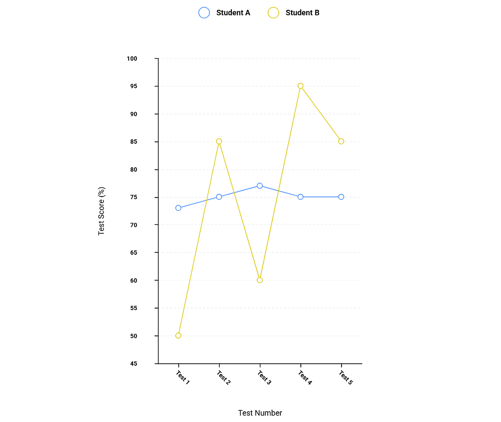
Example: Consider two students, both with a 75% average. Student A’s test scores are consistently 73%, 75%, 77%, 75%, 75% (low standard deviation, very consistent). Student B’s scores are 50%, 85%, 60%, 95%, 85% (high standard deviation, highly variable). The standard deviation reveals that Student A is more predictable, while Student B’s performance is erratic. This insight is invisible if you only look at the mean.
Covariance and Correlation
These statistics measure relationships between two variables.
- Covariance indicates whether variables move together.
- Correlation standardizes this relationship to a scale from -1 to +1.
Correlation is used when you want to understand if and how strongly two variables are related. It’s invaluable in fields like economics, psychology, and machine learning.
Example: Studying hours and exam scores typically show positive correlation (more studying → higher scores). However, ice cream sales and drowning deaths also show positive correlation, not because ice cream causes drowning, but because both increase in summer. This illustrates a crucial point: correlation does not imply causation.

Median and Quartiles
- The median is the middle value when data is sorted
- Quartiles divide your data into four equal parts.
Together, they provide a robust picture of your data’s distribution.
The median is superior to the mean when dealing with skewed data or outliers. Quartiles help you understand the full distribution, not just the center.
Example: Housing prices in a city might have a median of $400,000 but a mean of $650,000. This gap immediately tells you the distribution is right-skewed with some very expensive properties pulling the mean upward. The median better represents what a typical buyer should expect to pay.

Interquartile Range (IQR)
The IQR is the difference between the 75th percentile (Q3) and 25th percentile (Q1), representing the middle 50% of your data.
The IQR is a robust measure of spread that isn’t affected by outliers. It’s excellent for identifying outliers and understanding the core distribution.
Example: In salary data for a company, the IQR might span from $45,000 to $75,000, even though salaries range from $30,000 to $500,000 (including executives). The IQR shows you where most employees fall, and anything beyond 1.5 × IQR from the quartiles is typically flagged as an outlier.

Percentiles and Quantiles
- Percentiles divide your data into 100 equal parts
- Quantiles is the general term for any such division (quartiles for 4, deciles for 10, etc.).
Percentiles are perfect for comparing individual values to a distribution and understanding relative standing.
Example: Standardized test scores often use percentiles. If you scored in the 85th percentile, you performed better than 85% of test-takers. This is more meaningful than the raw score alone because it provides context.
Mode
The mode is the most frequently occurring value in your dataset.
The mode is most valuable for categorical data or discrete distributions. It’s the only measure of central tendency that makes sense for non-numeric data.
Example to keep in mind: In a shoe store, knowing that the modal shoe size is 9 is more actionable than knowing the mean size is 8.7. You should stock more size 9 shoes. Similarly, the most common complaint in customer service reviews (the mode) is more useful than averaging numerical ratings.
Multiple modes: Data can be bimodal (two peaks) or multimodal (several peaks), which often indicates distinct subgroups in your data. For instance, gym attendance might peak in early morning and evening, revealing two distinct user groups.
Choosing the Right Statistics
The key to effective data analysis is selecting appropriate statistics for your context:
- Symmetric, normal data: Mean and standard deviation work well
- Skewed data or outliers: Prefer median, IQR, and percentiles
- Categorical data: Mode is your primary tool
- Relationship analysis: Use correlation, but verify with visualizations
- Risk and consistency: Variance and standard deviation are essential
Okay, this was the theory part. Let me take you to a code-based journey. I prepared an Tweet-Statistic-Analyzer that is statistical analysis tool for exploring tweet length patterns and summary statistics. Built with Python, Streamlit, and modern data science libraries.

Conclusion
Understanding these summary statistics transforms raw data into actionable insights. The art lies not just in calculating them, but in knowing which ones tell the most honest story about your data.
Summary Statistics was originally published in Towards AI on Medium, where people are continuing the conversation by highlighting and responding to this story.